Overview
A good content layout is one that is easy to navigate and understand. It should be visually appealing and engaging while highlighting your most important content. Make sure to consider your target audience, the purpose of your website, the content, the navigation and the design when you are planning your content layout.
Put plainly, a good content layout can lead visitors’ focus in the right direction—gravitating them toward what matters most first, and then continue to the following sections in order of significance. A layout can also be used to enhance your design, create interesting interactions and show that you’re up-to-date with web design trends.
良好的內容佈局是易於導航和理解的。它應該具有視覺吸引力和吸引力,同時突出顯示您最重要的內容。在規劃內容佈局時,請務必考慮您的目標受眾、網站的目的、內容、導航和設計。
簡單地說,良好的內容佈局可以將訪客的注意力引導到正確的方向——首先將他們吸引到最重要的內容上,然後按照重要性順序繼續閱讀以下部分。佈局還可以用來增強您的設計,創建有趣的互動並表明您了解最新的網頁設計趨勢。
choose the right content layout
When approaching the task of choosing a content layout, there are two main factors to take into account:
-
Accommodate your content:
The layout you choose should be fitting for your type of content. Why? A content layout needs to help tell the story you wish to deliver to visitors. Hence, choose one whose arrangement will enhance and support your message.Some types of content layouts are best used for showcasing products or works, making them more suitable for an online eCommerce website or portfolio websites. Others convey factual information quickly and efficiently, and might work better for creating a blog or news platform.
-
Use common layouts:
While there’s room for creativity, the most well-known, tried-and-tested content layout s are usually the best option. These classic layouts tend to feel familiar to users, as they build on existing expectations, past experiences and the principles of design.
在選擇內容佈局的任務時,需要考慮兩個主要因素:
-
規納內容:
您選擇的佈局應該適合您的內容類型。為什麼?內容佈局需要幫助講述您希望向訪客傳達的故事。因此,選擇一種能夠增強和支持你的訊息的安排。某些類型的內容佈局最適合展示產品或作品,使它們更適合線上電子商務網站或作品集網站。其他人可以快速有效地傳達事實訊息,並且可能更適合創建部落格或新聞平台。
-
使用通用佈局:
雖然有創造力的空間,但最知名、經過考驗的內容佈局通常是最好的選擇。這些經典佈局往往會讓使用者感到熟悉,因為它們建立在現有的期望、過去的經驗和設計原則的基礎上。
Z-pattern layout
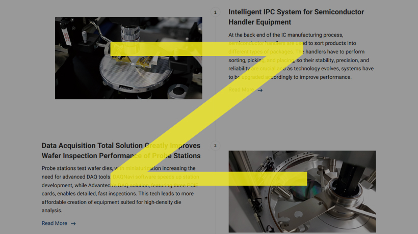
When coming across a new webpage, we immediately glance over it to take in the gist of things. This speedy scan, called skim reading, is often done in the shape of the letter Z or in zig-zag form. Our eyes move from the top left corner to the top right corner, then down to the bottom left, and finally to the right again. The Z-pattern website layout utilizes this reading habit through asymmetry by spreading important information across a Z shape.
當遇到一個新網頁時,我們會立即瀏覽它以了解重點。這種快速掃描稱為略讀,通常以字母 Z 的形狀或之字形進行。我們的視線從左上角移動到右上角,然後向下移動到左下角,最後再次移動到右側。 Z 型網站佈局透過不對稱性將重要資訊分佈在 Z 形上,從而利用了這種閱讀習慣。
F-pattern layout
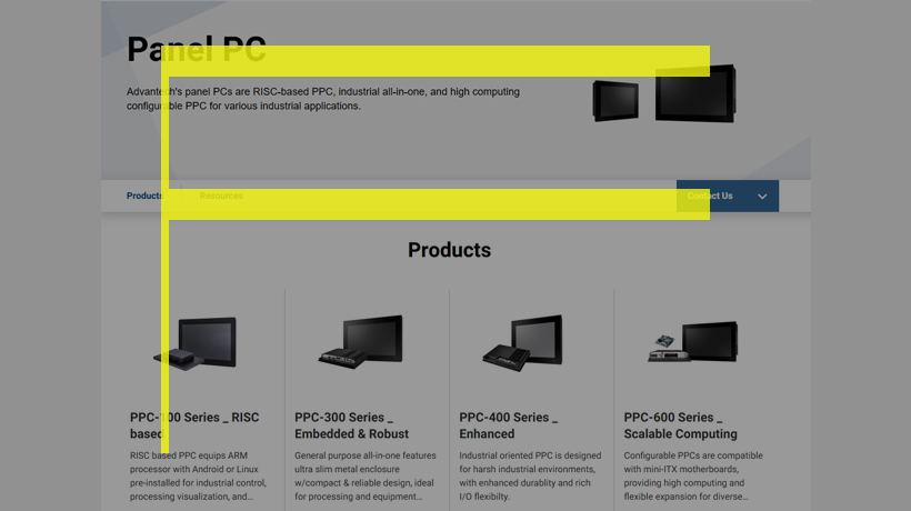
Much like the Z-pattern layout, this design is also based on a common page scanning behavior. With webpages that are more text-heavy, we tend to skim or read the information in an F shape. This means that the top horizontal part of the page gets the bulk of our attention, and our eyes go vertically downwards from there, with the left-hand side tending to serve as our focal point.
與 Z 圖案佈局非常相似,此設計也基於常見的頁面掃描行為。對於文字較多的網頁,我們傾向於以 F 形瀏覽或閱讀資訊。這意味著頁面的頂部水平部分吸引了我們的大部分注意力,我們的眼睛從那裡垂直向下,左側往往成為我們的焦點。
Fullscreen image layout
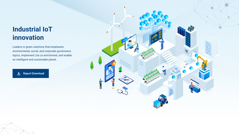
With an extra large visual placed front-and-center, a fullscreen image layout can result in an eye-catching and immersive homepage design. Large media features can convey a lot about who you are and what you do in as much as a glimpse. The great thing about this layout is that it looks great on mobile devices, too.
透過在前面和中間放置超大的視覺效果,全螢幕影像佈局可以帶來引人注目的沉浸式主頁設計。大型媒體專題可以一瞥就傳達出許多關於您是誰以及您在做什麼的訊息。這種佈局的優點在於它在行動裝置上看起來也很棒。
Split screen layout
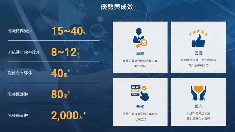
By vertically splitting the screen down the middle, a split screen layout creates a perfectly symmetrical balance and avoids the presence of negative space. This neat division into two parts allows for each section to express an entirely different idea—or alternatively, to support one idea from two different angles.
透過將螢幕從中間垂直分割,分割畫面佈局創造了完美的對稱平衡,並避免了負空間的存在。這種整齊地劃分為兩個部分的方式允許每個部分錶達一個完全不同的想法,或從兩個不同的角度支持一個想法。
Single column layout
This website layout includes all of its content in one vertical column. It’s a simple, straightforward design. Navigating a single column layout is easy —visitors immediately know to scroll down the page for more information. However, there’s one important website navigation tip to keep in mind using this layout:add a “Back to Top” button or a fixed menu to help users explore your site further.
該網站佈局將其所有內容包含在一個垂直列中。這是一個簡單、直接的設計。瀏覽單列佈局很容易——訪客立即知道向下捲動頁面以獲取更多資訊。但是,使用此佈局時需要記住一個重要的網站導航提示:新增「返回頂部」按鈕或固定選單以幫助用戶進一步探索您的網站。
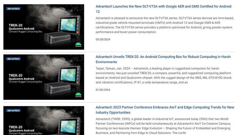
Box-based layout
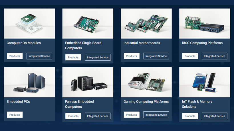
The box-based, or grid-based website layout merges multiple pieces of content into one geometric design. With each bit of information neatly constrained into a box, the elements don’t overshadow one another—resulting in a unified look. Each box leads to a different webpage, where users can learn more about the topic they’re interested in most.
基於框或基於網格的網站佈局將多個內容合併到一個幾何設計中。由於每一位訊息都整齊地限制在一個盒子中,因此元素不會相互掩蓋,從而形成統一的外觀。每個框都會指向不同的網頁,使用者可以在其中了解有關他們最感興趣的主題的更多資訊。
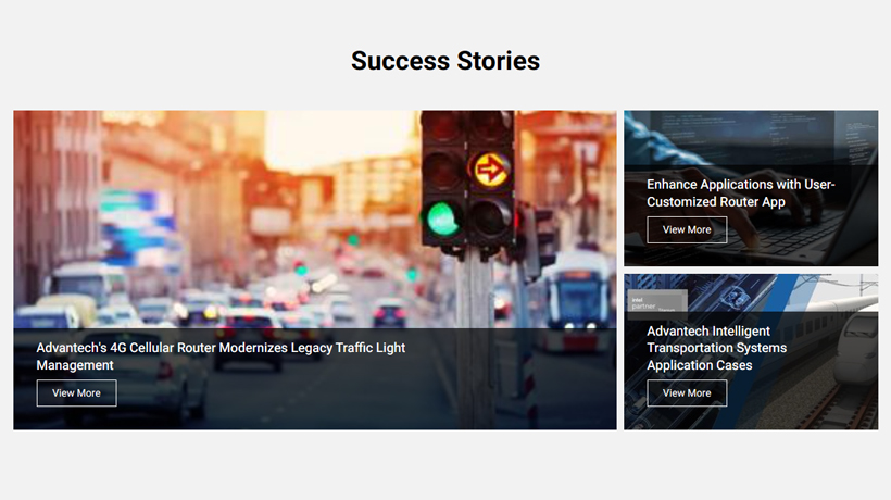
Cards layout
Much like the box-based layout, a cards layout uses multiple boxes or other rectangular-esque containers to display diverse content. This website layout is for the most part non-hierarchical, meaning that no one item truly stands out over the others, and all of the information is treated equally.
與基於盒子的佈局非常相似,卡片佈局使用多個盒子或其他矩形容器來顯示不同的內容。該網站佈局在很大程度上是非層次結構的,這意味著沒有任何一項能夠真正脫穎而出,並且所有資訊都得到平等對待。
Conclusion
When designing a website, it is incredibly important to draft a wireframe first, a mockup if you will, where you’ll mention all the vital website parts, their content, and section placement. Having a ready-to-follow web page design layout will save you time during further development.
Which layout to choose? It depends on the goal you wish to achieve. There are many layout types, each having its own peculiarities and suitable for particular niches.
I hope the article helped you find more website layout ideas and inspiration.
在設計網站時,首先草擬一個線框圖是非常重要的,在其中你會提及所有內容佈局重點。擁有一個現成可遵循的網頁設計佈局將在後續開發中流程節省你的時間。
應該要選擇哪種內容佈局?這取決於你希望達成的目標,我希望這篇文章能幫助你找到更多網站佈局的想法和靈感。