Overview
Heebo is a modern style font with clean lines and clean design. It's suitable for many applications, including titles, logos, labels and prominent text.
Heebo是一款現代風格的字體,具有清晰的線條和簡潔的設計。它適用於許多應用,包括標題,標誌,標籤和顯眼的文字。
It is characterized by fashion and modernity, which can bring a young, lively and fashionable atmosphere to the website.Currently used in Web Design Resources, WPC Event pages If your website wants to project a modern and stylish image, Heebo may be a good choice.
Heebo的特點是時尚和現代感,可以給網站帶來一種年輕、活潑和時尚的氛圍。 目前已使用在Web Design Resources , WPC相關活動網站. 如果您的網站希望表現出一種現代和時尚的形象,Heebo可能是一個不錯的選擇。
The current default typeface using on Advantech Corporate site is Heebo, the new typography using variable fonts, which offer more control such as font weight.
研華公司網站上使用的預設字體是 Heebo,這是一種使用可變字體的新字形,可提供更多控制,例如字體粗細。
The Factors
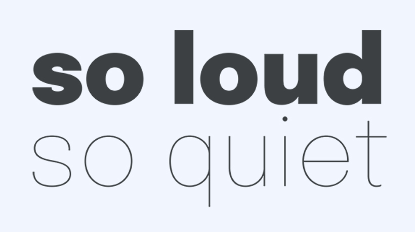
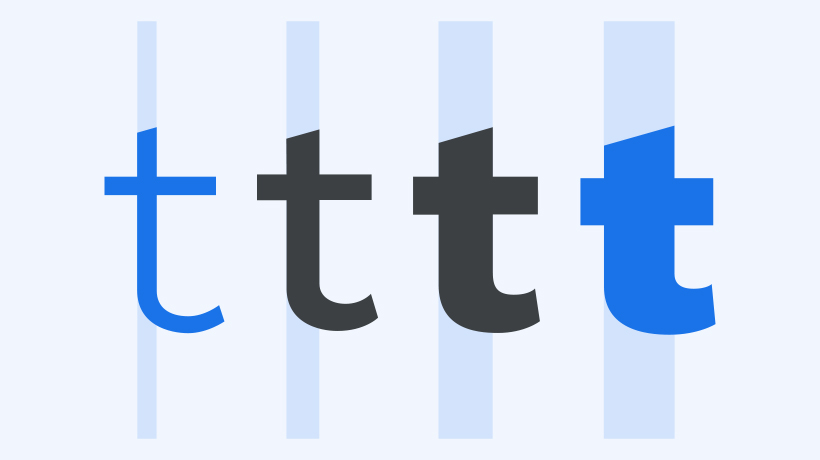
Weight is the overall thickness of a typeface’s stroke in any given font. The most common weights are regular and bold, but weights can cover extremes from the very light to the very heavy. With the weight axis in variable fonts, that number is effectively unlimited.
粗細是任何給定字體中字體筆劃的整體粗細。 最常見的權重是常規的和粗體的,但權重可以涵蓋從非常輕到非常重的極端情況。 由於粗細軸採用可變字體,因此該數字實際上是無限的。
Typically, font weights range from hairline and extra light at the lightest (i.e., thinnest) end of the spectrum, all the way to black or ultra at the heaviest (i.e., thickest).
通常,字體粗細的範圍從最輕(即最細)端的細線,一直到最重(即最粗)的黑體。
Benefits - Improving Text Readability
However, there are in fact many scenarios where multiple weights—if not multiple styles—are not just desired, but essential.
然而事實上,在許多情況下,多種字體粗細不僅是需要的,而且是必需的。
There is one most essential principle of typography that is of utmost importance: readability. If the text is difficult to read in practice, then all other design is irrelevant. And this applies not only to long texts in articles but also to short captions, legends in charts, and all text in the interface in general.
排版有一個最重要的基本原則:可讀性。 如果文字難以閱讀,那麼所有其他設計都是無關緊要的。 這不僅適用於文章中的長文,也適用於短標題、圖表中的圖例以及介面中的所有文字。
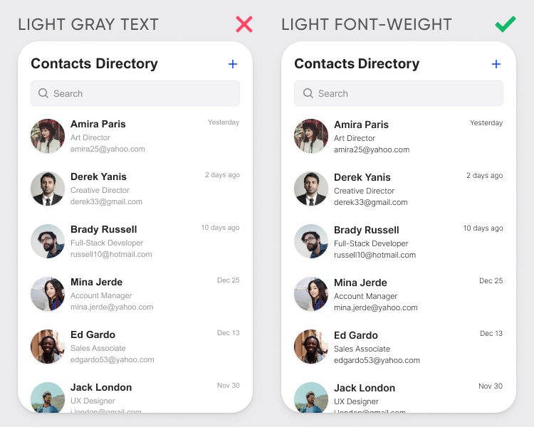
Designer often use light grey as secondary text. Think again before you use light gray text on your interface. Light gray text isn't optimal for readability, especially for low-vision users. Unfortunately, most designers haven't caught on and use it quite oftent.
設計師經常使用淺灰色作為輔助文字。 在介面上使用淺灰色文字之前請三思。 淺灰色文字的可讀性不佳,尤其是對於弱視使用者而言。 不幸的是,大多數設計師還沒有意識到並經常使用它
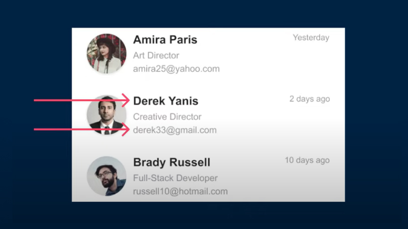
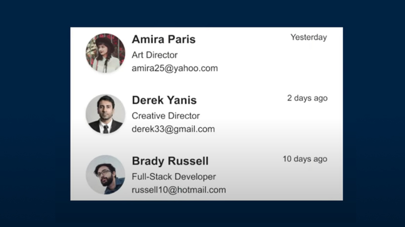
If you’re using the same font color on everything, when it run together, they’ll became hard to scan. And that’s when a designer can use lighter font color or different weight of bold text to help increase the text readability.
如果您在所有內容上使用相同的字體顏色,整體來看它們將變得難以掃描。 這時設計師可以使用較淺的字體顏色或不同粗細的粗體文字來幫助提昇文字的可讀性。
Font Family
| Language | Font |
|---|---|
| English | Heebo |
| Traditional Chinese | Microsoft JhengHei |
| Simplified Chinese | Microsoft YaHei |
| Japanese | Meiryo |
| Korean | Malgun Gothinc |
Font Size
| HTML Tags | Desktop/Tablet | Mobile |
|---|---|---|
| H1 | 44px | 36px |
| H2 | 36px | 26px |
| H3 | 22px | 22px |
| H4 | 18px | 18px |
| H5,P | 16px | 16px |
Embed code
Copy-paste the stylesheet <link> into your <head> before all other stylesheets to load our CSS.
<link rel="preconnect" type="text/css" href="https://fonts.googleapis.com">
<link rel="preconnect" type="text/css" href="https://fonts.gstatic.com" crossorigin="">
<link rel="stylesheet" type="text/css" href="https://fonts.googleapis.com/css2?family=Heebo:wght@100;400;500;700;800&display=swap">
<link rel="stylesheet" type="text/css" href="https://www.advantech.com/css/common-1200.min.css">
<link rel="stylesheet" type="text/css" href="https://www.advantech.com/css/common-mq-1200.min.css">
CSS Setting
CSS class for a variable style
// <weight>: Use a value 100 , 300, 400, 500, 700, 800 //
. CSS { font-family: "Heebo","Arial" sans-serif; font-weight: <weight>; }
Font Weight
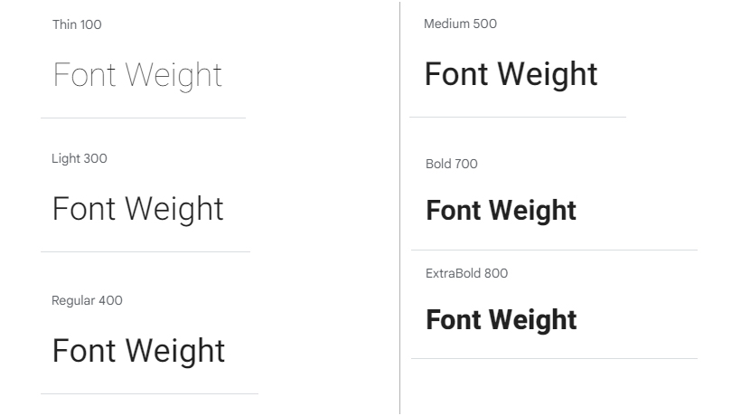
Learn how to use font-weight to improve text readability, below are the selected font weight;
了解如何使用字體粗細來提高文字可讀性。
Conclusion
Usually, if the text and the overall interface have a good design, users don't pay much attention to it. They just scan or read the information and get what they need. The website visitors do not notice what font is used in the design; they perceive the words and read the text rather than enjoy the interface's composition and beauty.
通常,如果文字和整體介面設計得很好,用戶不會太多感受。 他們只需要能掃描或閱讀資訊並獲得他們需要的東西即可。 網站到訪客不會注意到設計中使用了什麼字體; 他們會接收文字並閱讀內容,而不是欣賞介面的構圖和美感。
Often, users will not be able to say exactly why this interface, where they quickly and easily find information or perform an action, is so good.
很多時候用戶無法準確地說出為什麼這個介面如此好,而且他們可以在其中快速輕鬆地找到資訊或執行操作。
But everything changes if the design makes it difficult to read texts. Here all the reasons are on the surface, and any user will tell you what's wrong: too small font, too bright color, too faded colors, etc.
但如果設計使得閱讀文本變得困難,問題在此時都會呈現出來,通常都是字體太小、顏色太亮或太淺等等。
Poorly designed texts give users an impression of your interface in a fraction of a second, and they understand that it is made sloppy, not attractive. Such an interface will not deserve attention, does not give the impression of reliability, and will be uncomfortable to use.
設計不良的文字會讓使用者在不到一秒的時間內對您的介面產生印象,並且他們知道它是草率的,沒有吸引力。 這樣的介面不值得關注,不會給人可靠的印象,使用起來會很不舒服。
Start using font-weight correctly on your text. Stop using light gray for secondary text and the same bold font on every heading.
開始在文字上正確使用字體粗細,避免在輔助文字中使用淺灰色,並在每個標題上使用相同的粗體字體。
