Font size guidelines
The font size is already set up in CMS platfrom. Please follow the font size hierarchy and use the corresponding HTML tag. Please do not put a unique style to a single HTML element.
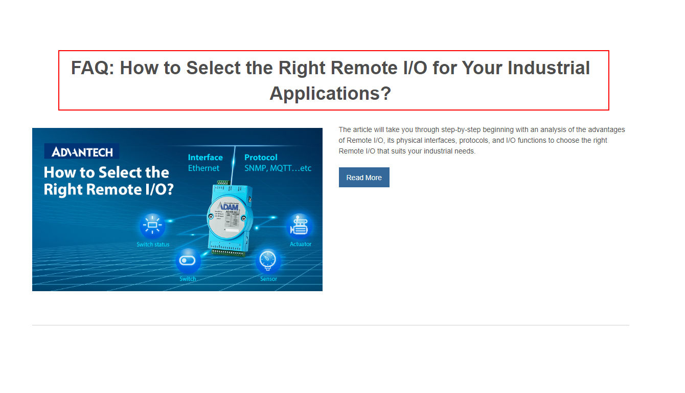
Section Title (H2):36PX / Bold
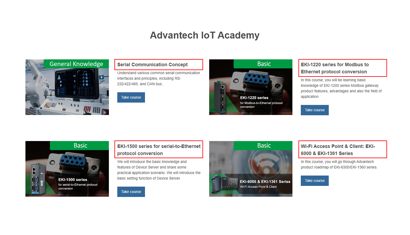
Section Sub Title (H3):18PX / Bold
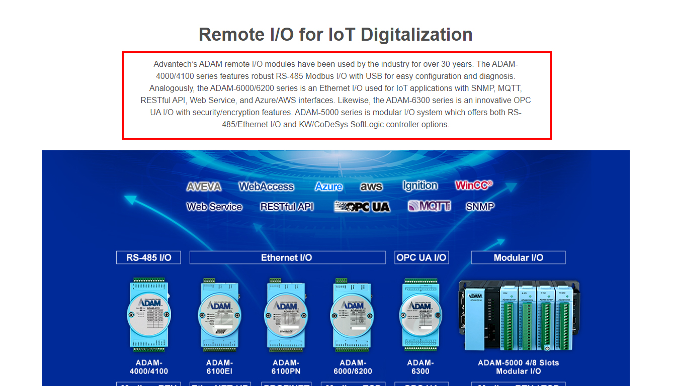
Main Paragraph (P):16PX
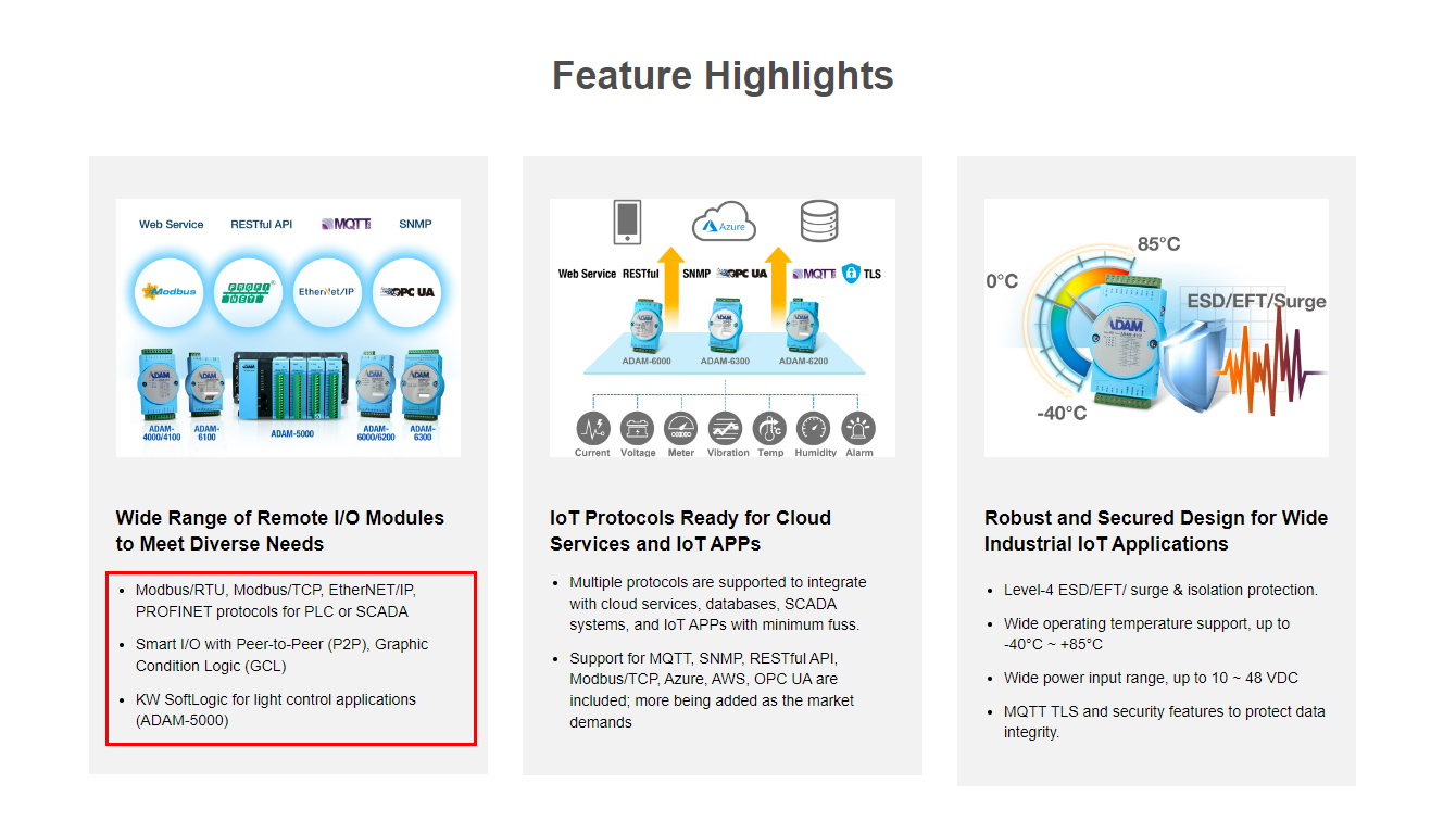
Bullet point (li):14PX
Content color
The content color is already set up in CMS platform and also includes the HTML links.
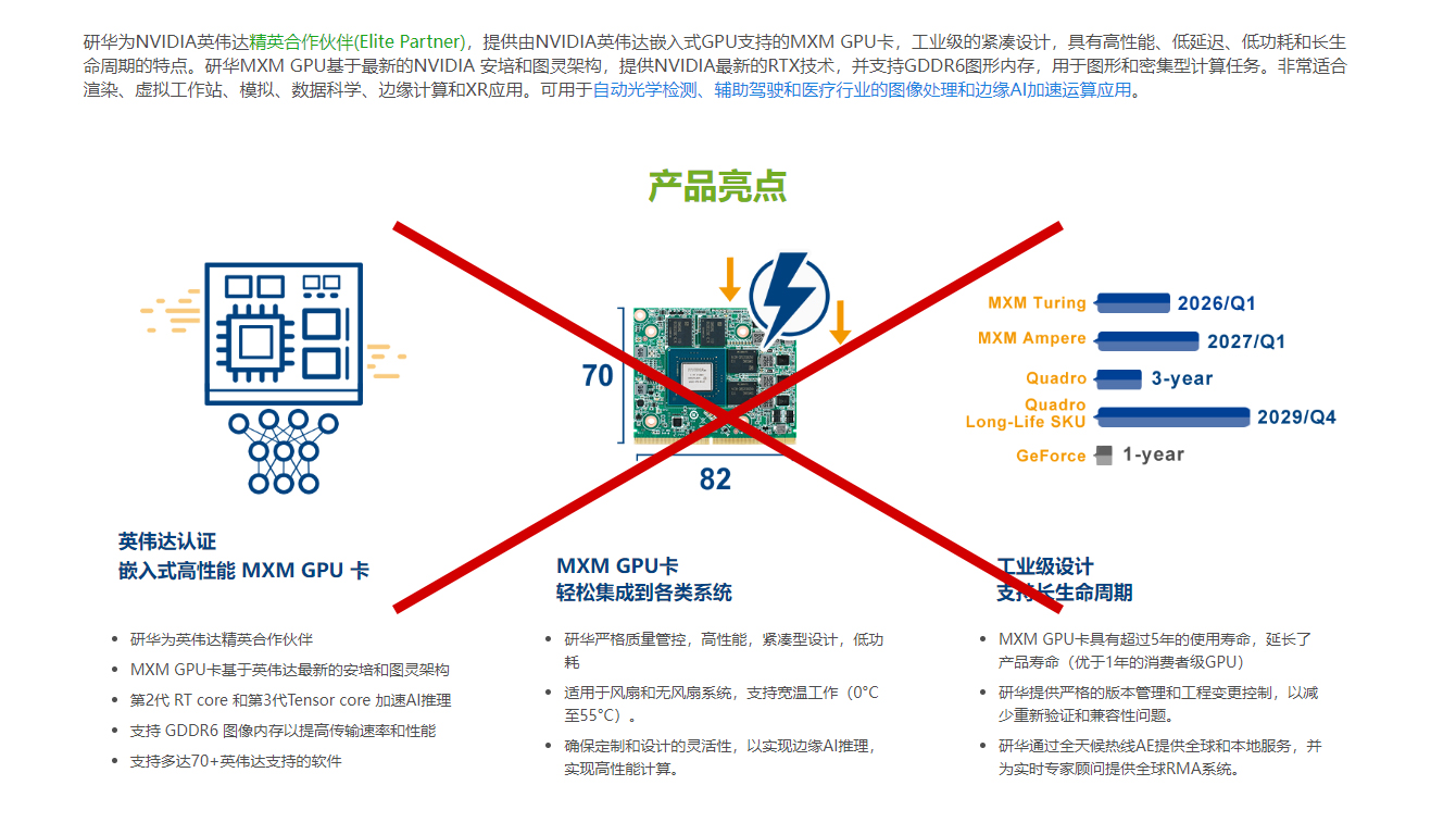
Don'ts
Adjust the content color. Advantech blue only for the HTML links.
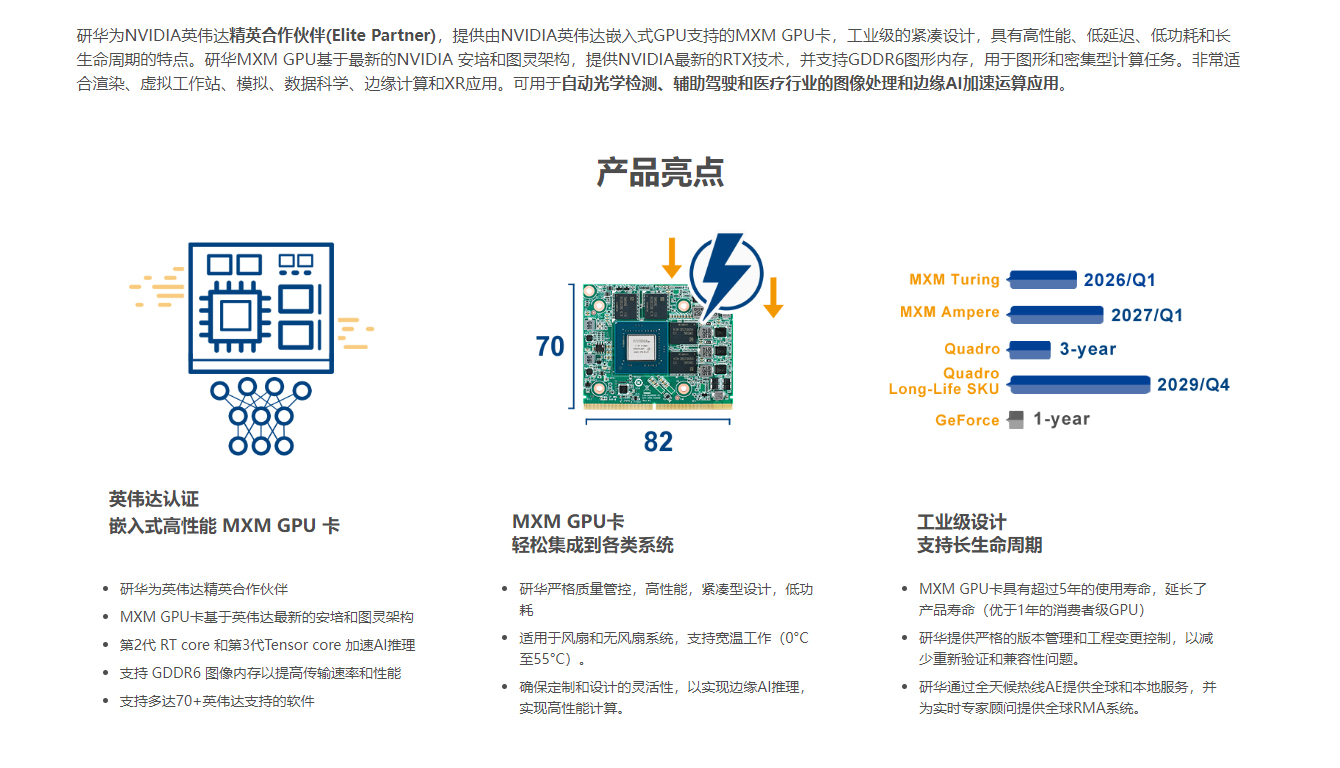
Dos
Use bold text to highlight the main point of the content.
Layout suggestion
The webpage size becomes a maximum width of 1600 pixels. Please use more than three cards for each section.

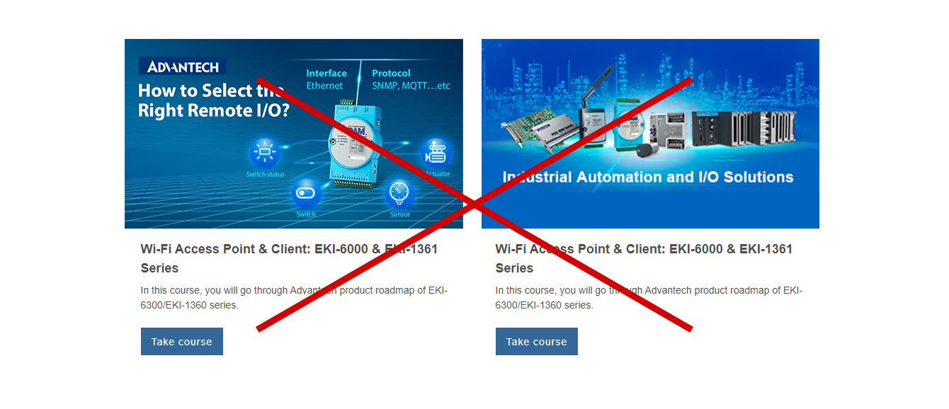
Don'ts
Putting two cards in one section would make the image area too big.
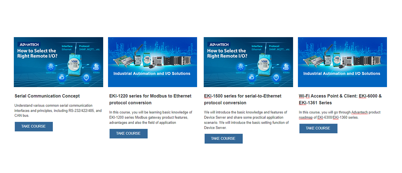
Dos
Put three to four cards in one section.
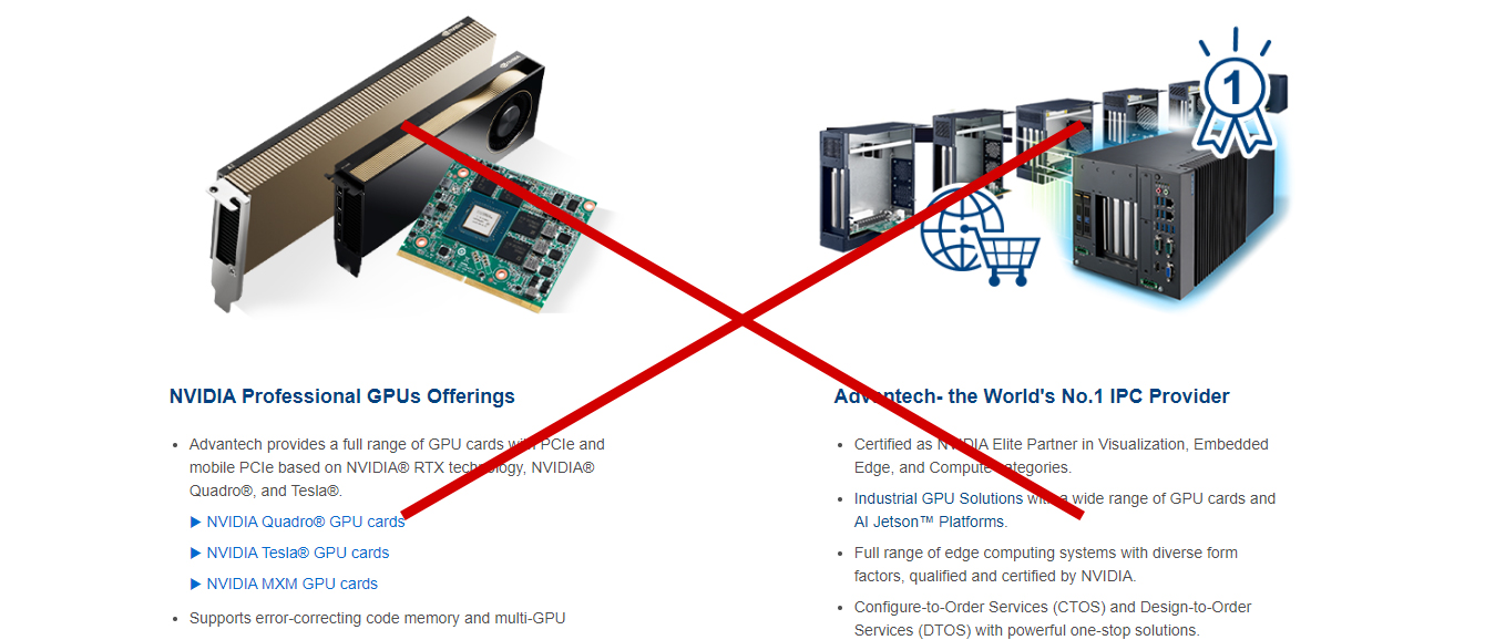
Don'ts
Putting two cards in one section would make the image area too big.
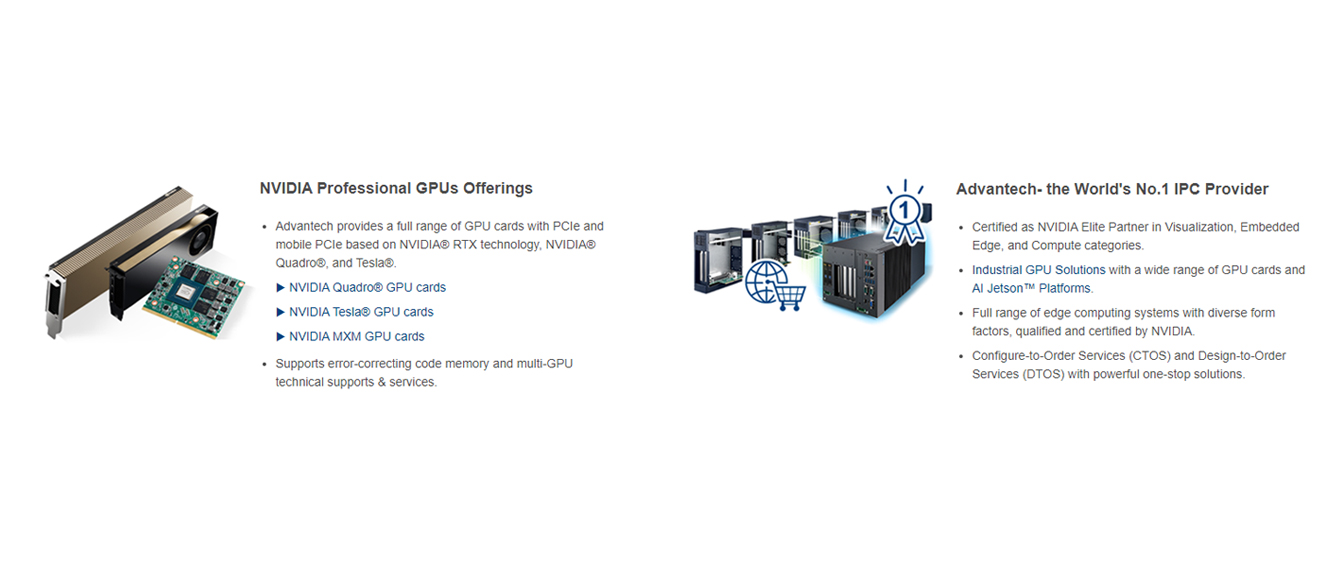
Dos
Use horizontal cards instead of the vertical card.

Don'ts
Please avoid use multiple column for long text content. The word break makes it difficult to read.

Dos
Use horizontal cards instead of the vertical card.
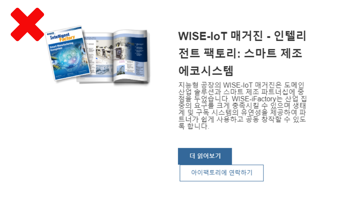
Don'ts
Please avoid using space tab to create blank space, which would caused elements display unblanced.
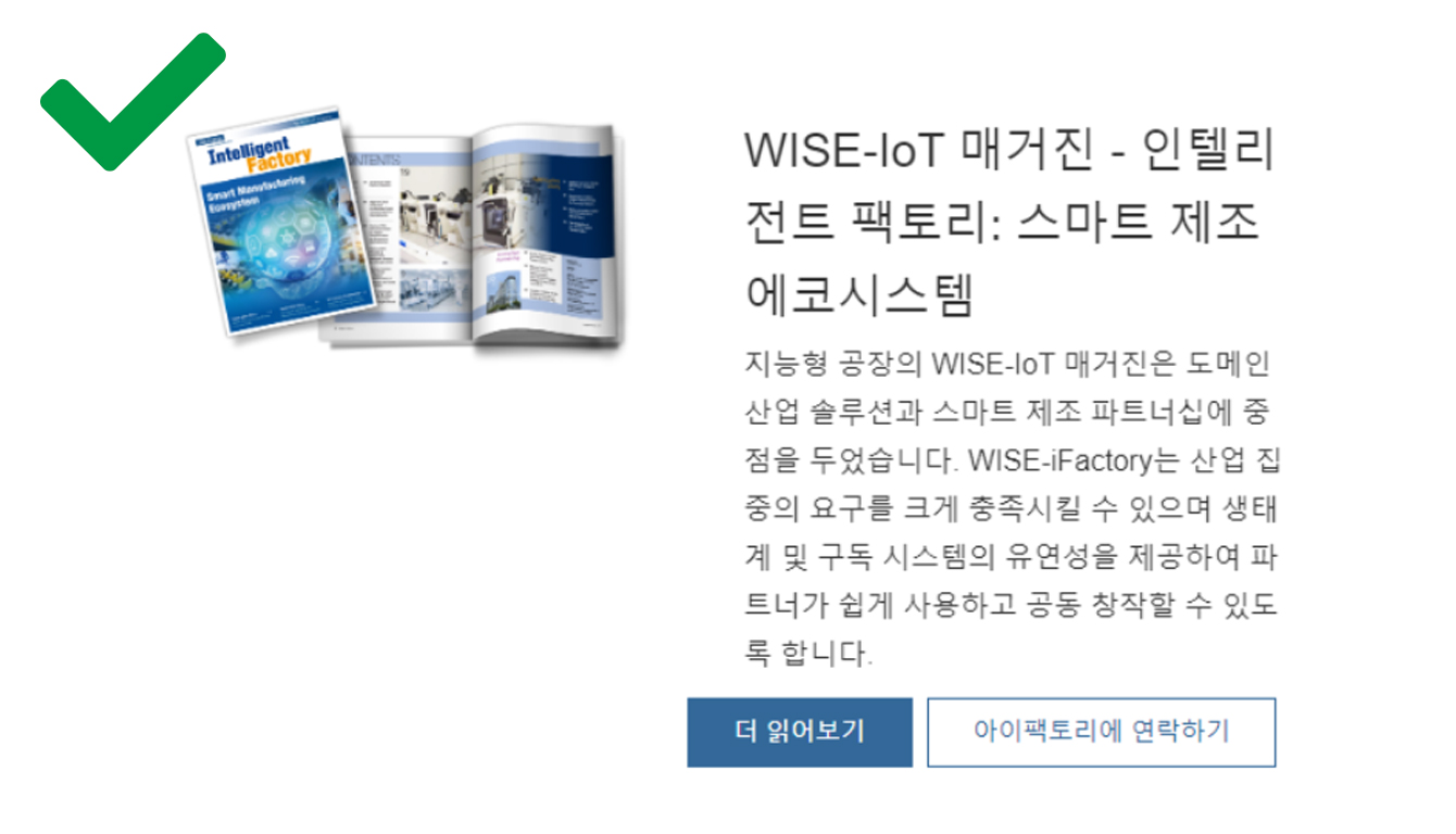
Dos
Keep the module's original settings which the margin or padding is preset
Don'ts
Please avoid increasing the font size without blance the content display.
Dos
Please set the proper font size
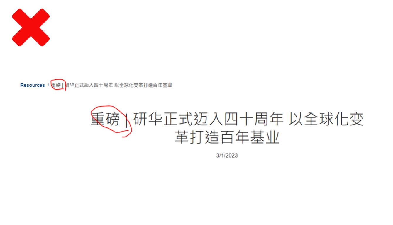
Don'ts
Please avoid use special symbol on the page title.
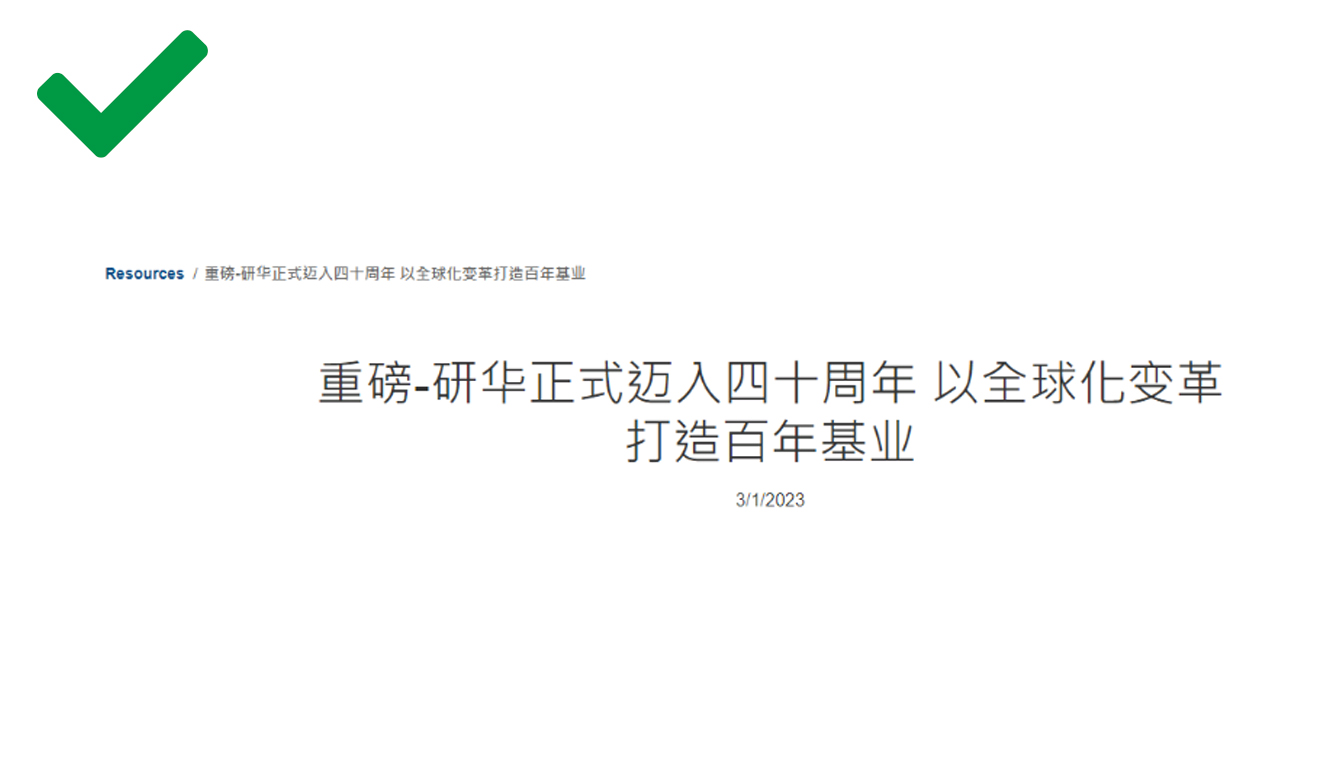
Dos
Use proper symble to display propler when it aslo appear in the breadcrumb.
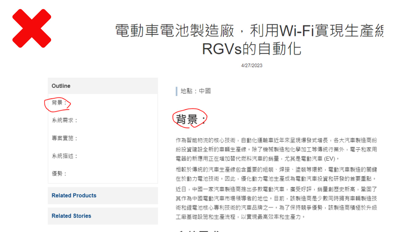
Don'ts
Please avoid use special symbol on the section title which would caused the left side quick select menu display inappropriate.
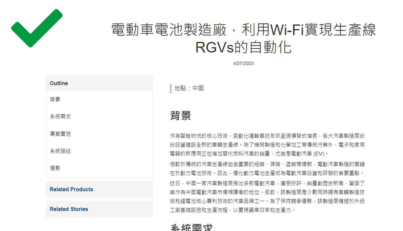
Dos
Keep section title in a simple and appropriate way.
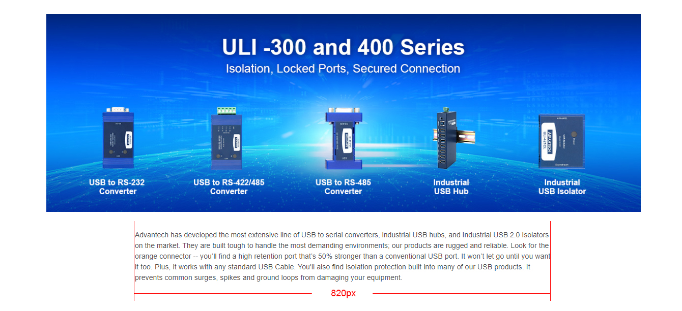
Text only block
Text only block's width should be set to 820px and aligned in the center.
Margins
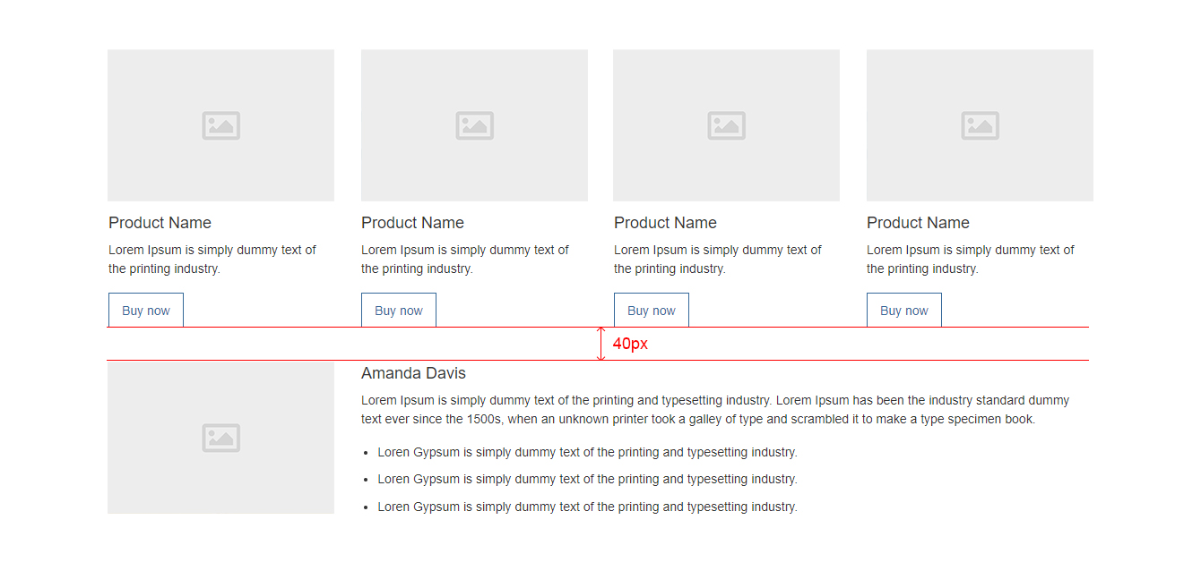
Margins between content blocks should be 40px
Learn how to add a blank in CMS platform. Click here
