Alternative Text (alt attribute)
1 Informative images
Images that graphically represent concepts and information, typically pictures, photos, and illustrations.
The alt attribute is the HTML attribute used in HTML and XHTML documents to specify alternative text that is to be rendered when the element to which it is applied cannot be rendered for whatever reason.
The alt attribute is used by "screen reader" software so that a person who is listening to the content of a webpage (for instance, a person who is blind) can interact with this element. Therefore, every image should have an alt attribute to be accessible, but it need not contain text. It can be an empty or null attribute: alt="" (see section 2.1).
The text alternative alt attribute should be a meaningful short description of information consistent with an image—e.g., “Product News” or “Marketing Materials” for product or marketing news section images.
Example: < img src="/html/images/Product01.png" alt="Product News"/>
1.1 Images, icons, or buttons used to label information
Try to be consistent with the visual image, so for example text alternatives “Telephone contact:” and “Fax number:” can be used to identify the image, icon or button associated with each contact number.

1.2 Images used to supplement other information
Sometimes images are used to supplement adjacent text that helps further explain the purpose of the information. A short text alternative description is embedded in the image directly and used to visually present information not explained in the text. I; in this case, the alt attribute is still “Products News, Marketing Materials”.

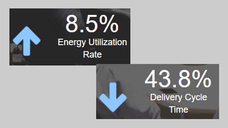
1.3 Images used to convey succinct information
This simple diagram illustrates data visually. The information is short and succinct, so the text alternative might be, “increasing rate/decreasing delivery time” given as the alt attribute.
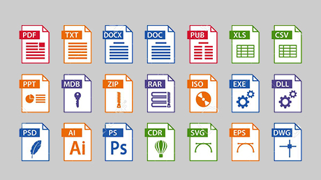
1.4 Images conveying file formats
In this example, a document is available to download in three different formats identified by format icons within text links. They may have the alt attributes such as “HTML”, “Word document”, and “PDF” to distinguish the file types.
1.5 Images conveying an impression or emotion
This photograph shows a group that’s happy to receive their award. It is being used to give the impression that this group or the company it represents is happy and honored. The text alternative for this image is “We’re happy and honored to receive this award”, as this best describes the intended impression.

2 Decorative Images
Decorative images do not add information to the content of a webpage. For example, any information provided by the image might already be conveyed using adjacent text, or an image might be included to simply make the website more visually
2.1 Images used as part of page design
This image is used as a border in the page design and has a purely decorative or informative purpose. In these cases, a null (empty) alt attribute should be provided (alt="") so that they can be ignored by assistive technologies such as screen readers.
2.2 Styled text with decorative effect
This following image is used to convey a slogan text with decorative effects. The alt attribute for this image is the same as the slogan presented in the image: “Your access to the city”.

3 Functional Images
Functional images are used to initiate actions rather than to convey information. They are used in buttons, links, and other interactive elements.
3.1 Image used alone as a linked logo
The logo below is also an image of the Advantech corporate brand, but in this case, its primary function is to link to the homepage, so the word “home” was added to the alt attribute.

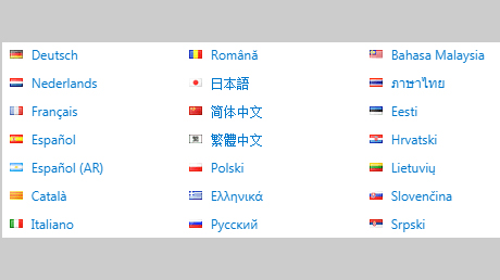
3.2 Icon images conveying information within linked text
In this example, the image follows a linked text to inform users that the link is used to select the preferred language. It has the alt attribute of “select language” to convey the meaning of the icon.
3.3 Images used in a button
The following image is used to give the button a distinct style. In this case, it is the button to initiate a search request and is an icon representing a magnifying lens. The alt attribute for the image is “search” to convey the purpose of the button.

4 Complex Images
Complex images contain substantial information – more than can be conveyed in a short phrase or sentence. These are typically:
- Graphs and charts, including flow charts and organizational charts
- Diagrams and illustrations where the page text relies on the user being able to understand the image.
4.1 Description containing structured information
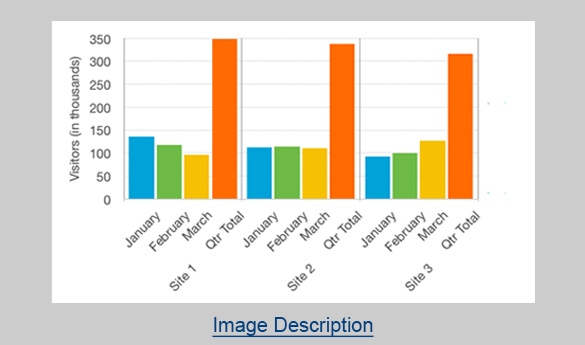
In this example, a bar chart of website visitor statistics has the short description “Bar chart showing monthly and total visitors for the first quarter 2014 for sites 1 to 3”. If the description contains over 75~150 letters, you may consider adding a text link to a longer description. In this case, “Image Description” is used.
4.2 Description containing textual information
The element referenced by aria-describedby is treated as one continuous paragraph of text. In this example, the head of the peacock is described using a paragraph of text that is on the web page.
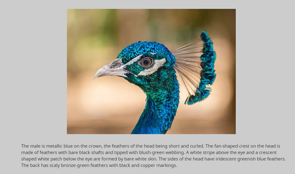
<p id="description"> ...The back has scaly bronze-green feathers with black and copper markings.</p>5 Customized Button or hyperlink using aria-label
The aria-label attribute can also be used to identify form controls. The best practice is to add specific information to each form control when there are different buttons or links on the same page and each serves a different purpose. This approach is well supported by screen readers and other assistive technology

| HTML | Aria-label Value |
|---|---|
| button class="btn" | aria-label="view more ___ information" |
| div class="module adv-link-more" | aria-label="see all" |
6 Using aria-label to provide labels for objects
The purpose of this technique is to provide a label for objects that can be read by assistive technology. The aria-label attribute provides the text label for an object, such as a button. When a screen reader encounters the object, the aria-label text is read so that the user will know what it is.
- Example 1
where there are more than two of the same type of landmark on the same page, and there is no existing text on the page that can be referenced as the label.
<div role="navigation" aria-label="Primary">
  <ul><li> Content start here </li></ul>
</div>
<div role="navigation" aria-label="Secondary">
  <ul><li> Content start here </li></ul>
</div>
- Example 2
The following example shows how a generic "region" landmark might be added to a weather portlet. There is no existing text on the page that can be referenced as the label, so it is labelled with aria-label.
<div role="region" aria-label="weather portlet">
  ...
</div>
Contrast Ratio and Accessibility
Good color contrast ensures visibility and legibility under a wide range of lighting conditions, screens, and device settings.
1 Fonts and contrast ratio
The aria-label attribute can also be used to identify form controls. The best practice is to add specific information to each form control when there are different buttons or links on the same page and each serves a different purpose. This approach is well supported by screen readers and other assistive technology
Determining the contrast ratio of the colors used in your page design and their effect on the readability of text against a colored background at various font sizes is an extremely useful accessibility metric.
Contrast ratio is a measurement of the visual tonal difference (tonal, not color or hue value difference) between two colors. A minimum contrast ratio of 4.5:1 is recommended highest contrast (black on white, or the reverse) has a ratio of 21:1. Conversely, a low contrast ratio of 1:1, say blue text on a green background would mean text would disappear to a person who is colorblind.
NOTE: If you were to view webpages in greyscale then these values would become very apparent. This is why web developers in the past would test their webpages on black and white monitors. If pages are clear and legible in greyscale, then they will work in color.| TEXT | NORMAL | BOLD | RATIO AA | RATIO AAA |
|---|---|---|---|---|
| Small | <24px | <19px | 4.5:1 | 7:1 |
| Large | >24px | >19 | 3:1 | 4:5:1 |
Demo
1 Image Carousel
| HTML | Aria-label Value |
|---|---|
| div class="module adv-key-visual-carousel" | aria-label="slideshow of solutions" |
| span class="owl-prev" | aria-label="Previous Item" |
| span class="owl-next" | aria-label="Next Item" |
| div class="owl-pages" | aria-label="slideshow of solutions" |
| button class="btn" | aria-label="view more __ information" |
| nav class="navbar-nav" | aria-label="N/A" |
2 Advanced Carousel

| HTML | Aria-label Value |
|---|---|
| span class="owl-prev" | aria-label="Previous Item" |
| span class="owl-next" | aria-label="Next Item" |
| div class="owl-dots" | N/A |
| div class="owl-pages" | aria-label="slideshow of solutions" |
| button class="btn" | aria-label="view more __ information" |
3 Cards Carousel

| HTML | Aria-label Value |
|---|---|
| span class="owl-prev" | aria-label="Previous Item" |
| span class="owl-next" | aria-label="Next Item" |
| div class="owl-pages" | aria-label="slideshow of solutions" |
| button class="btn" | aria-label="view more __ information" |
| div class="module adv-link-more" | aria-label="see all" |
4 Single Card

| HTML | Aria-label Value |
|---|---|
| view more | aria-label="View more __ product" |
| solution site | aria-label="name of the solution site" |
5 Icon
| HTML | Aria-label Value |
|---|---|
| <i class="up"> | aria-label="Up" |
| <i class="down"> | aria-label="Down" |