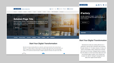
Required Check Items
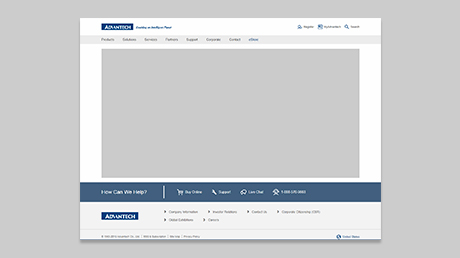
- 1. Please use Standard Header/Footer or Basic Header/Footer
- 2. You need to add the Google tag on every page of your website, please follow the instrution show as below
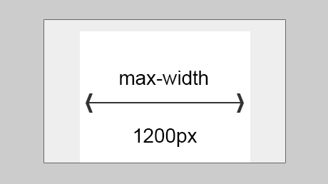
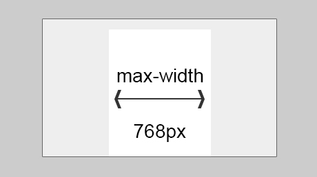
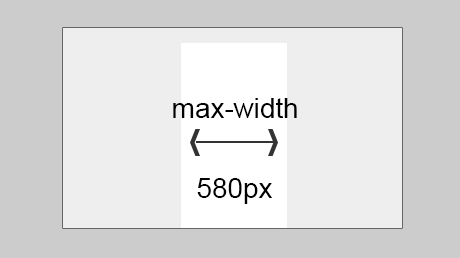
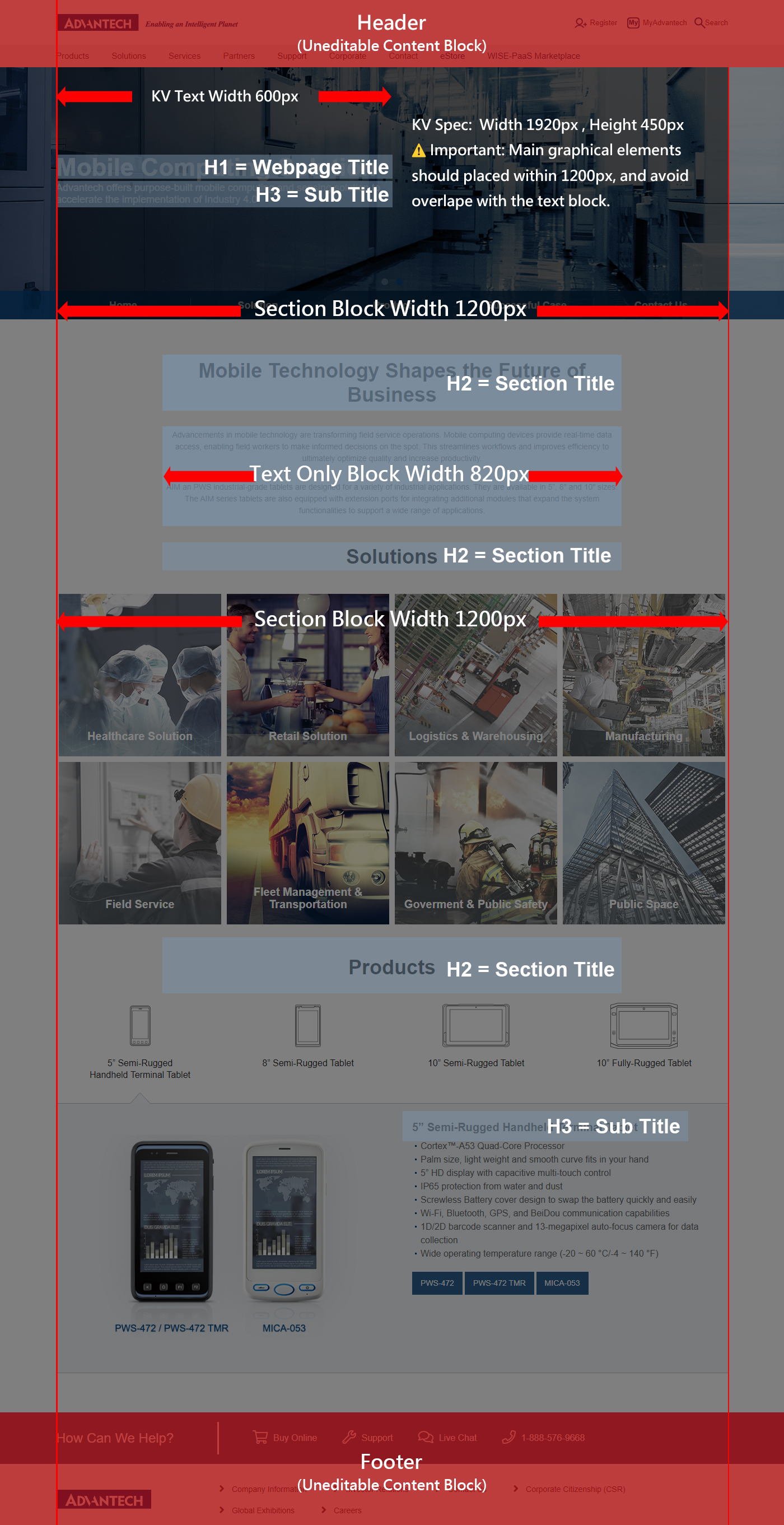
- 3. All section block width should be 1200px for PC, 768px for tablets, and 580px for mobile devices.
- 4. Text only block's width should be set to 820px and aligned in the center
- 5. Webpage title is defined as H1 (44px for PC/tablet, 36px for mobile), check below section for font size
- 6. Section title is defined as H2 (36px for PC/tablet, 26px for mobile), check below section for font size
- 7. The Key Visual (KV) and Navbar must use the templates, and structural changes or custom styles are not allowed.
- 8. When use two buttons together, use a solid button for main action and a ghost button for secondary action, check below section for RWD breakpoints
- 9. Please use the font family as mentioned in the web design guideline. If not, please make sure you use a license-free font
- 10. Optimize your images for the smallest file size possible, the target file size should be under 150 kb, and do not include unuse images
- 11. Please also make sure your webpage's readabilties on mobile devices, check below section for RWD breakpoints
- 12. Please make sure the web page readability meet the color contrast standard of 4.5, the exame tool is recommended on the below section
- 13. Please use the W3C HTML Validation Tool to checks the markup validity, and make sure there's no error messages.
- 14. Your webpage should be supported in the major browsers, such as latest version of Chrome, Safari, Edge, Firefox
- 15. Video KV's file size should be less than 10MB, please check Key Visual Guideline for more details
- 16. Ensure that text links within paragraph use the designated special style to enhance readability. For proper usage, refer to the below section
- 17. The "Back To Top" button on the official website is a required component. Do not modify its style or replace it with any other elements.
- 18. CSS and JavaScript files should include the project name, and the use of generic filenames such as index.css, style.css, or all.css is discouraged.
- 19. Unused code must be removed, and only CSS and JavaScript files actually used by the page may be retained.
- 20. All components must follow the established specifications, and structural modifications or inline styles are not allowed.
- 21. Existing system interactions and behaviors must not be duplicated or reimplemented, and rewriting built-in JavaScript functionality is not allowed.
Suggests Check Items
- 1. All section block alignment should be consistent
- 2. The first content block should be set to margin-top 70px, and the last content block should be set to margin-bottom 70px.
- 3. Text line height should be at least 1.3em or another reasonable number
- 4. Margins between content blocks should be 50px, or another reasonable setting
- 5. Margins on both the left and right side of the card item should be 10px or another reasonable setting
- 6. Padding within the content block should be 10px or a reasonable setting
AI HTML Checker

Key Checks of AI Tool
We’ve prepared an online AI tool to help you easily check your HTML files. It will review your files based on the checklist below and provide a clear report. Please make any necessary adjustments according to the results and attach the report when submitting your HTML files.
- HTML Validation: Pass W3C with no errors.
- Text Block Layout: 820px wide, centered.
- Template Usage: Use Content Page template.
- Shared Components: KV, Navigation, Back To Top required, no changes.
- Font Setting: Use Heebo only.
- Headings Rule: No font-size for h1, h2, h3 in CSS.
- CSS Restriction: No inline CSS; explain if needed.
Font Size
| HTML Tags | Desktop/Tablet | Mobile |
|---|---|---|
| H1 | 44px | 36px |
| H2 | 36px | 26px |
| H3 | 22px | 22px |
| H4 | 18px | 18px |
| H5,P | 16px | 16px |
Font Family
| Language | Font |
|---|---|
| English | Heebo |
| Traditional Chinese | Microsoft JhengHei |
| Simplified Chinese | Microsoft YaHei |
| Japanese | Meiryo |
| Korean | Malgun Gothinc |
Install the Google tag on your website
To start measuring website and ads performance, you need to add the Google tag on every page of your website, please follow the instrution show as below
開始評估網站和廣告成效之前,您必須先為網站上的每個網頁加入 Google 代碼。
| Where | <head> |
|---|---|
| How | Copy the first block of code and paste it as high in the <head> tag as possible 在緊靠 <head> 開頭標記後方的第一段位置,貼上這段程式碼 |
| Code | <!-- Google Tag Manager --> <script>(function(w,d,s,l,i){w[l]=w[l]||[];w[l].push({'gtm.start': new Date().getTime(),event:'gtm.js'});var f=d.getElementsByTagName(s)[0], j=d.createElement(s),dl=l!='dataLayer'?'&l='+l:'';j.async=true;j.src= 'https://www.googletagmanager.com/gtm.js?id='+i+dl;f.parentNode.insertBefore(j,f); })(window,document,'script','dataLayer','GTM-N4LS26');</script> <!-- End Google Tag Manager --> |
Demo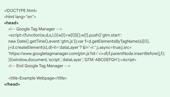 |
|
| Where | <body> |
|---|---|
| How | Copy the second block of code and paste it immediately after the opening <body> tag 在緊靠 <body> 開頭標記後方的第一段位置,貼上這段程式碼 |
| Code | <!-- Google Tag Manager (noscript) -->
<noscript><iframe src="https://www.googletagmanager.com/ns.html?id=GTM-N4LS26"
height="0" width="0" style="display:none;visibility:hidden"></iframe></noscript>
<!-- End Google Tag Manager (noscript) --> |
Demo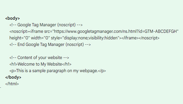 |
|
Accessibility Evaluation Tool
1. WAVE Web Accessibility Evaluation Tool is a suite of evaluation tools that helps to identify many accessibility errors, and also facilitates human evaluation of web content. You can use the online WAVE tool by entering a web page address (URL) in the field above.
2. WAVE Chrome, Firefox are available for testing accessibility directly within your web browser - handy for checking password protected, locally stored, or highly dynamic pages.
3. Color contrast checker for images tool, which you can upload image to detect foreground colour accessibility on a background image, it is intended as guide for designers and developers to test if their design solution is accessible.
When to Use Ghost Buttons
When users see two buttons together, they need to think about which button to click. They’ll read the text labels to decide, but putting visual cues on the buttons can help them decide quicker. A solid button for your main action and a ghost button for your secondary action will accelerate the user’s decision-making.
In the “bad” example above, you can see how the outline of a ghost button gets lost with the lines of text when it’s by itself. If you were scanning the page, you could easily miss the button.
In the “good” example, the solid button carries so much visual weight that it’s hard to miss it. Your attention is drawn to the main action even though its surrounded by text and another button. The secondary action is still visible by its close proximity, but it does not take attention away from the main action.
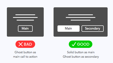
Pratice for when to use ghost button
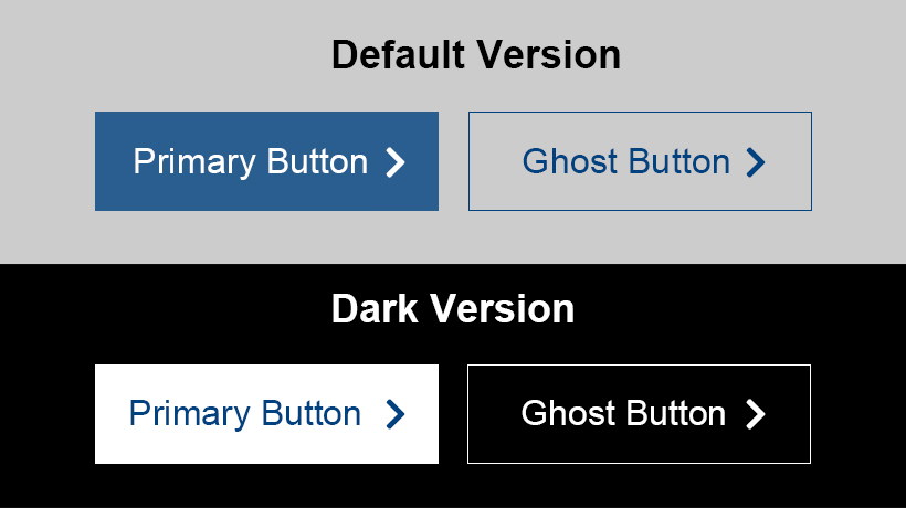
Call to Action Demo
- Primary Button: Backgorund color #336899 with white text
- Secondary button: Transparent background with Advantech blue text and border color (#004280)
- Button Hover: Backgorund color #004280 with white text
- Primary:Backgorund color white with blue text (#336899)
- Secondary button: Transparent background with white text and border color (#FFFFFF)
- Button Hover:Backgorund color white with Advantech blue text (#004280)
Text Link Style
The styles are already included in the official website's core CSS file. Simply reference them correctly to achieve the same effect.
Text links within paragraph :- Default Status: Color #336899 / dotted 3px
- Hover Status:Color #004280 / dotted 3px
- HTML Tag: <p><a href="#" class="link-dot-style"></a></p>
- Applies to: Paragraph
- Default Status: Color #004280
- Hover Status: Color #004280 / Text underline
- HTML Tag: <a>
- Applies to: Lists, tables, and bullet points
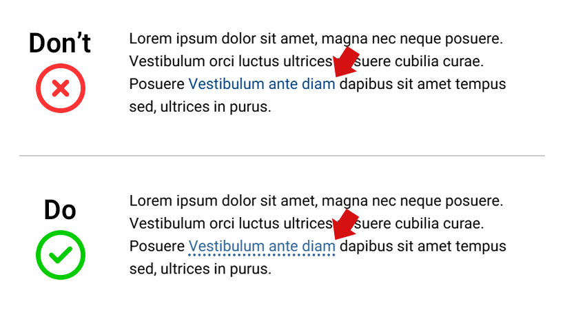
Style Demo
Line-height Setting
The line-height CSS property sets the height of a line box. It's commonly used to set the distance between lines of text, and balancing line length and font size In responsive web design. You can learn more from this article, if you're interested this topic.
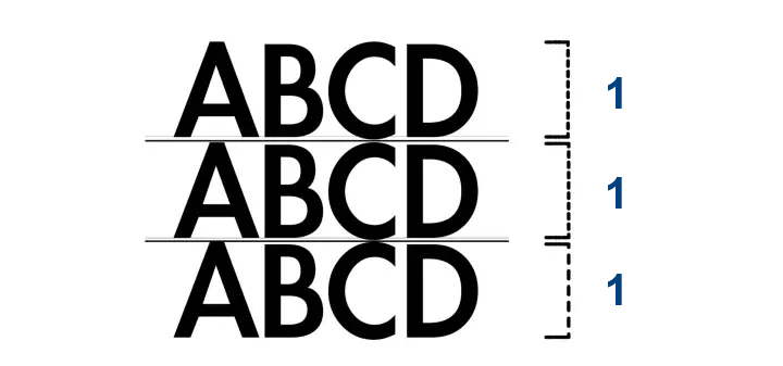
Default line-height as 1:1
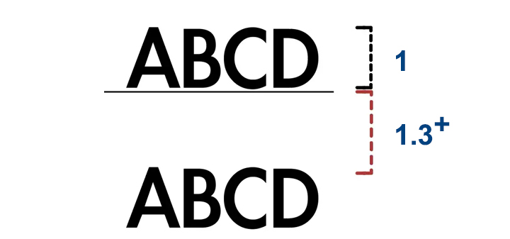
Set line-height from 1.3~1.5 or reasonble number
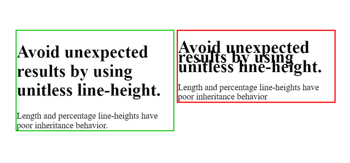
Result of different line-height
Case Study
The good web content is adapted proportional to screen size that's consider large-scale displays, so let's not forget to check the webpage on a large-scale display or test on your browser and optmized.
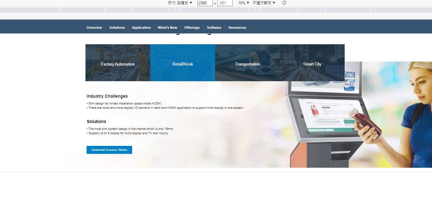
The background image is off to the right
From the screenshot above is showing the background images's position is off to the right, which you won't notice if you're visit the webpage on you mobile device. By centering the background image is the way to make sure that the backgorund image can be display normally on any device.
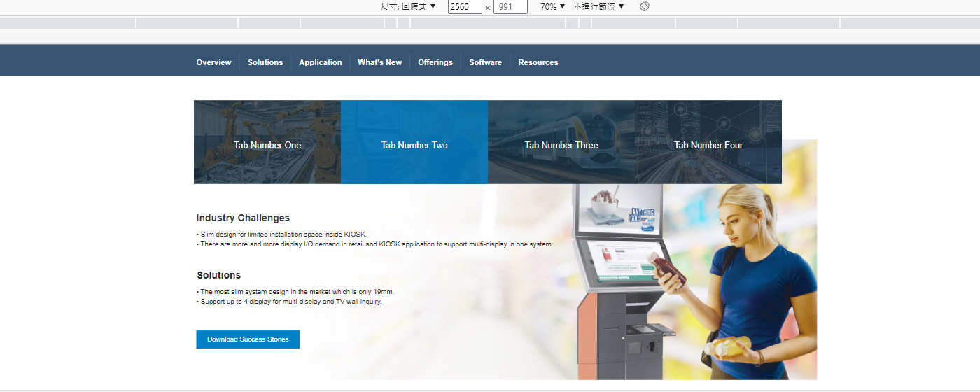
Adjusted background images position
References
Did You Really Check?
Why self-checking is important?
To detecting false design principles at the early stage of webpage design, can help avoid unnecessary adjustments and fasten the process of webpage design review.
How to self check?
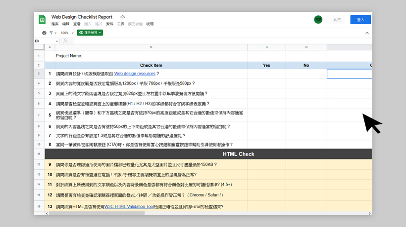
- Please download the self check form
- By checking the questions within the form as you review the Mockup or HTML
- Please included the self checking form everytime when the Mockup or HTML have made adjustments.
- Feel free to contact sally.yang@advantech.com.tw if you have any questions 😀
