The definitive guide to standardizing the design and code of UI kit is based on the Advantech website guidelines. You can use these components by copying and pasting to effortlessly build consistent user interfaces.
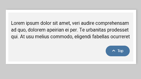
The back-to-top button appears when users scroll up, providing quick navigation to the top.
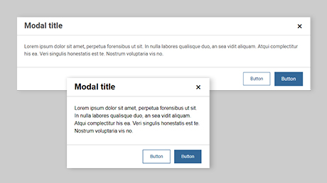
Add dialogues to your website, whether it's for lightboxes, user notifications, or entirely custom content presentation.
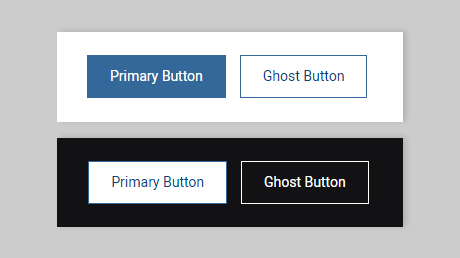
Buttons provide a clickable and let user take action.
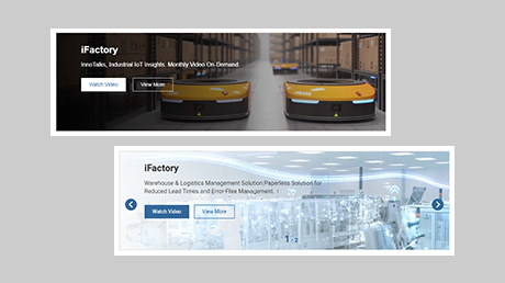
Can simultaneously showcase text, background images, or videos in a section. With multiple assets, a carousel effect will be demonstrated.
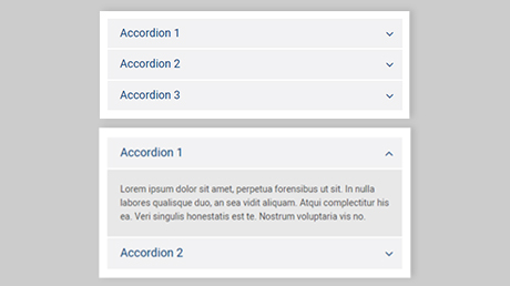
The accordion allows users to toggle the display of content sections
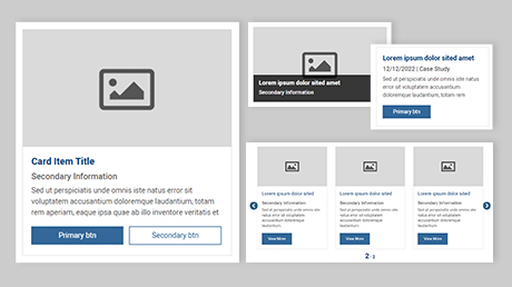
The Card provides a flexible and extensible content container with multiple variants and options
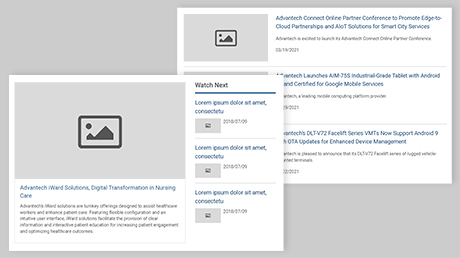
Lists help combine cards and content playlists
Loading will be used while a page or component area is being loaded
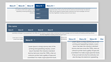
The navbar will stick to the top when you reach its scroll position
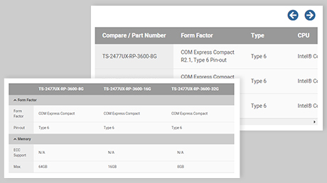
A table displays collections of data that are organized into rows
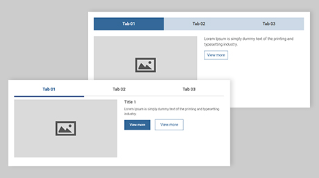
The tab component is used to hide content behind selectable tabs. These tabs are typically arranged horizontally at the top
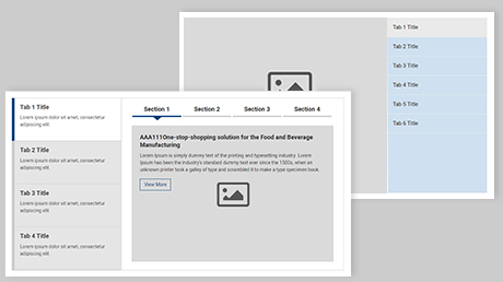
A component that shows groups of content, separated into tabs, and controlled by the tabs