Button
Buttons provide a clickable and let user take action.
content
Demo
Default version button
The button comes in three style versions: primary button, ghost button, and disabled button.
<button type="button" class="btn-primary" data-tracking-id="component-button-default">Primary Button</button>
<button type="button" class="btn-secondary" data-tracking-id="component-button-default">Secondary Button</button>
<button type="button" disabled class="btn-primary" data-tracking-id="component-button-default">Disabled Button</button>
Dark version button
Please add the class name .dark for the dark version of the button style.
Basic Usage
Please avoid duplicating the reference to the same CSS and JS files.
CSS
Copy-paste the stylesheet <link> into your <head> before all other stylesheets to load our CSS.
<link rel="stylesheet" type="text/css" href="https://advcloudfiles.advantech.com/design/web-design-guides/component/css/style.css">
Reference
When to Use Ghost Buttons:
When users see two buttons, they have to think about which one to click. Visual cues on the buttons can help them decide faster. Using solid buttons for primary actions and ghost buttons for secondary actions can speed up user decision-making.
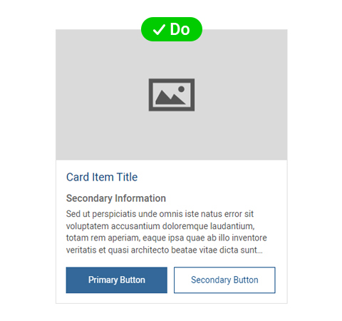
Do
The solid button's prominent visual presence ensures its noticeability, effectively drawing attention to the main action without detracting from surrounding elements.
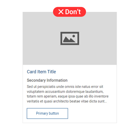
Don't
The ghost button's outline blends with surrounding text, potentially leading to it being overlooked during page scanning.