Required Check Items
- 1. Section title is defined as H2 (36px for PC/tablet, 26px for mobile), check below section for font size.
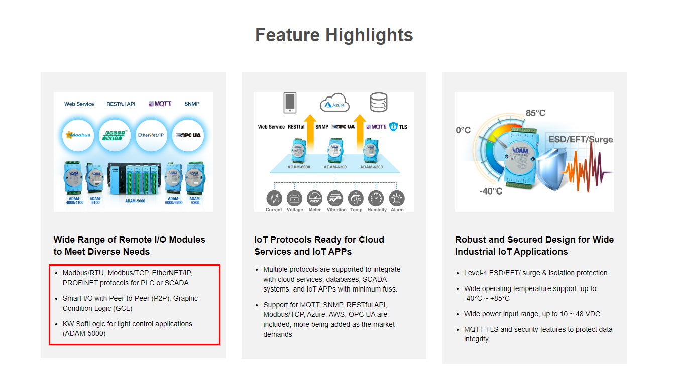
- 2. Use Advantech blue as linked text or elments with hyperlink, avoid use mulitple colors to style text. Please check below section for references.
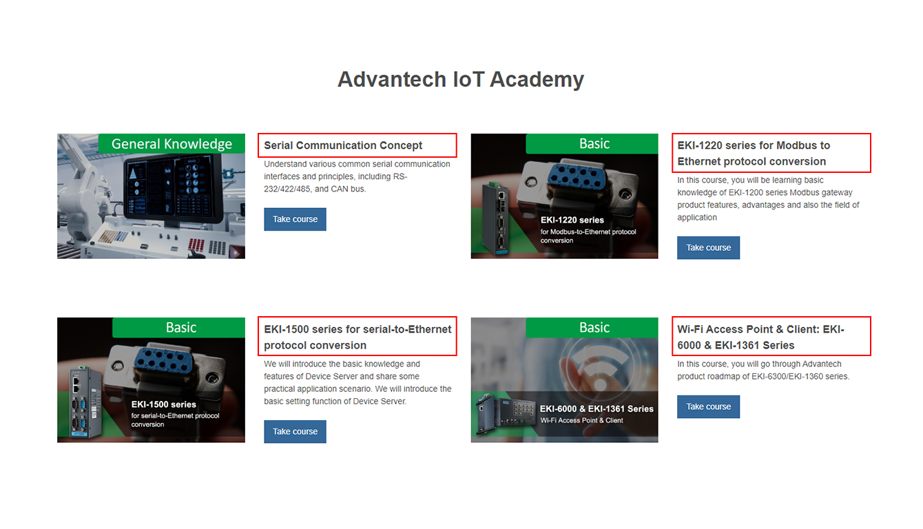
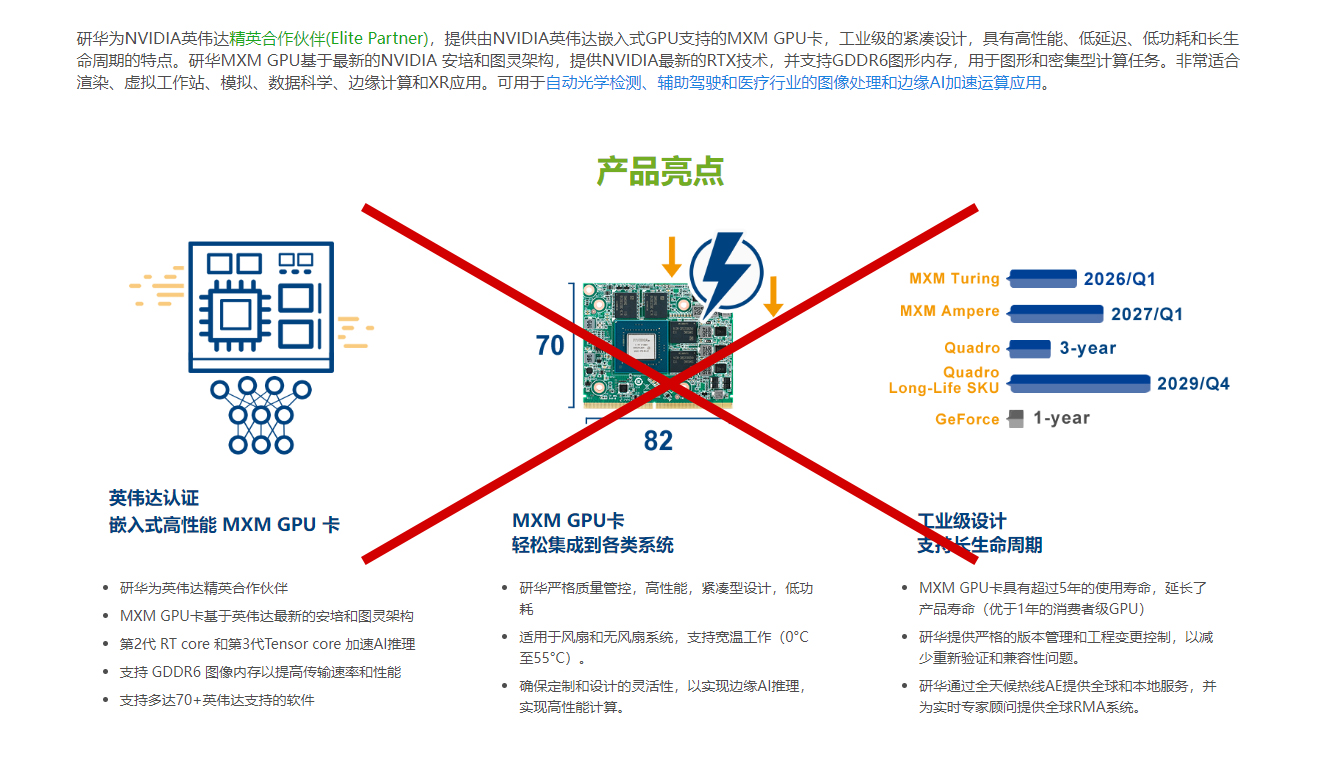
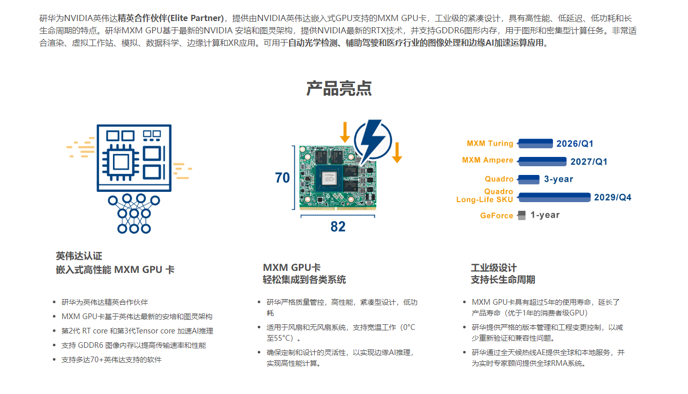
- 3. Please remove Advantech logo from the images since the website logo is already on the same page. Please check below section for references.
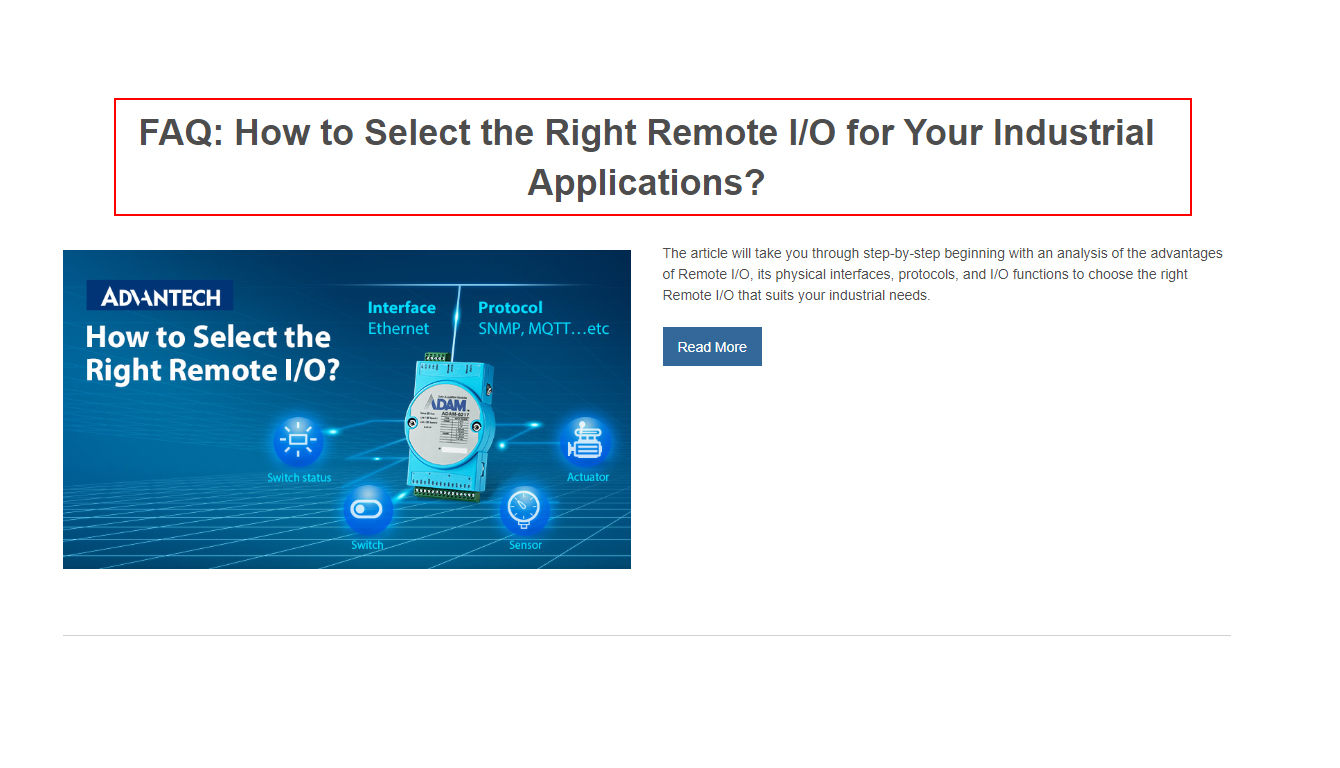
- 4. Please avoid use special symbol on the page title or section title. Please check below section for references.
- 5. Please avoid using multimple main images that would inceasing the overall height. Please check below section for references.
- 6. Text only block's width should be set to 820px and aligned in the center. Please check below section for references.
- 7. Prepard image with 1200px width for the single colum image, and 820px for the component, which will mention in the below section
- 8. Please make sure the image readability meet the color contrast standard of 4.5, the exame tool is recommended on the Colors page
- 9. Please design the text content on a image as part of the graphical elment, which will mention in the below section
- 10. Remember to give the alternative text when using the image component, which will mention in the below section
Font size guidelines
The font size is already set up in CMS platfrom. Please follow the font size hierarchy and use the corresponding HTML tag. Please do not put a unique style to a single HTML element.
Section Title (H2):36PX / Bold
Section Sub Title (H3):18PX / Bold
Main Paragraph (P):16PX
Bullet point (li):14PX
Content styling
Use Advantech blue as linked text or elments with hyperlink, avoid use mulitple colors to style text.
Don'ts
Adjust the content color. Advantech blue only for the HTML links.
Dos
Use bold text to highlight the main point of the content.
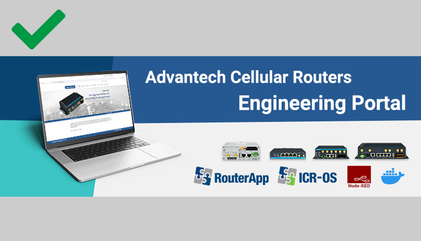
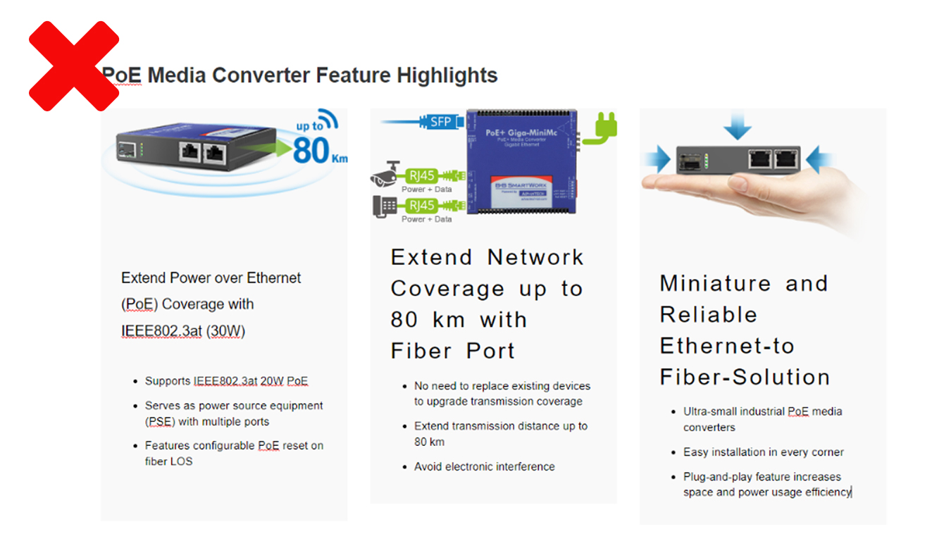
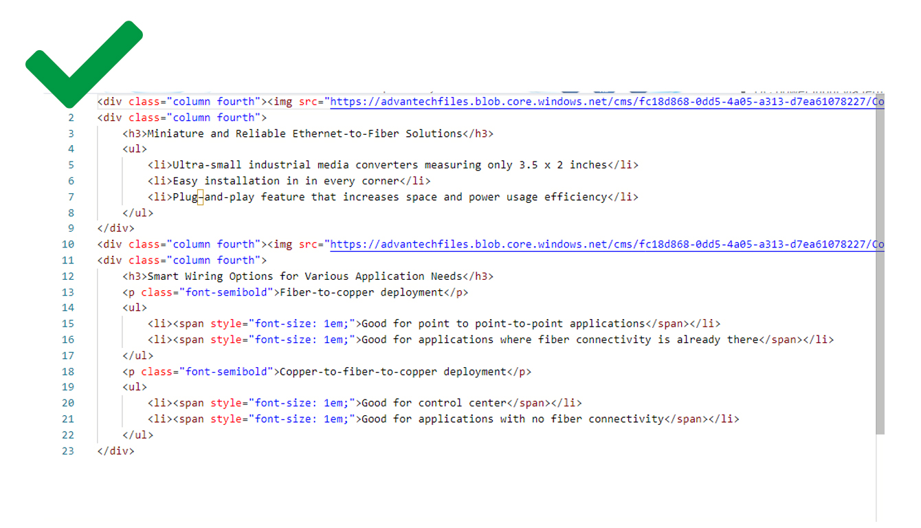
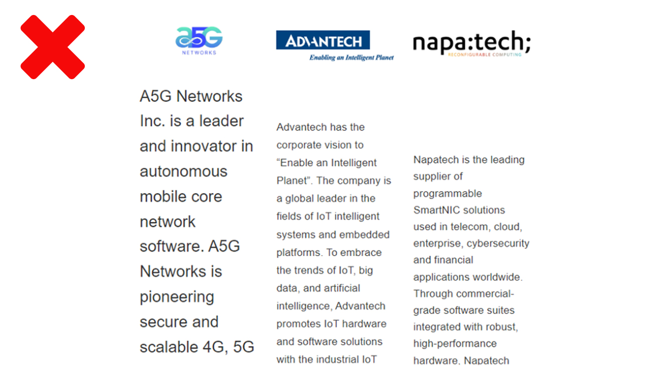
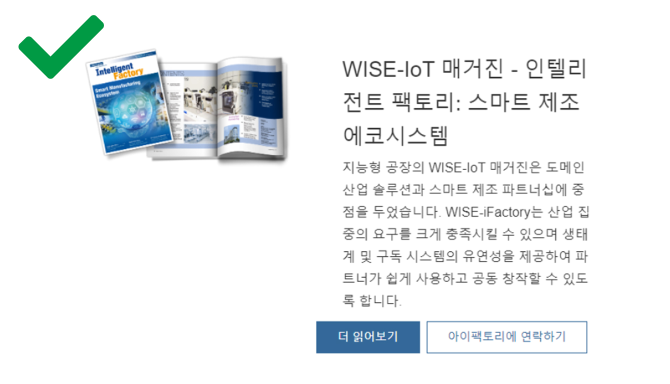
Please remove Advantech logo from the images since the website logo is already on the same page.
Don'ts
Use the outsourced images and have Advantech logo on it
Dos
Please remove Advantech logo from the images since the website logo is already on the same page.
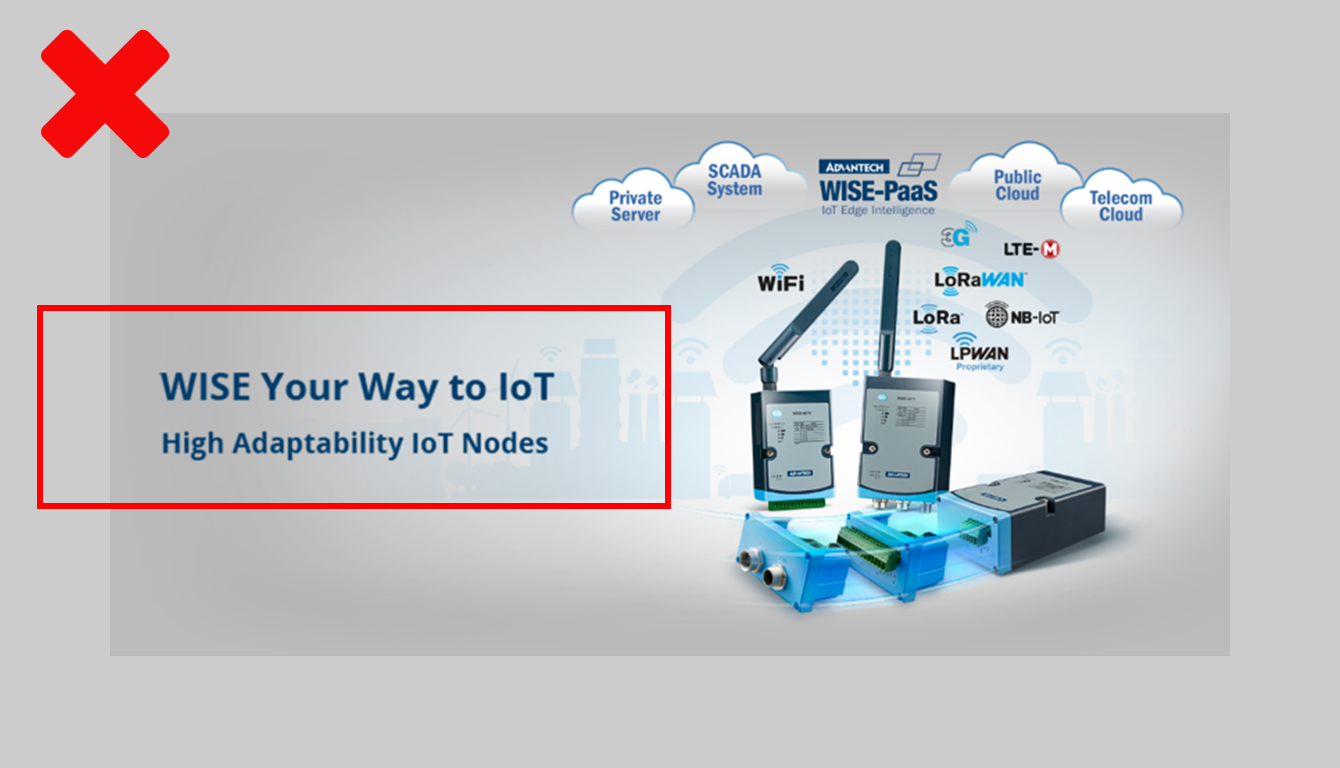
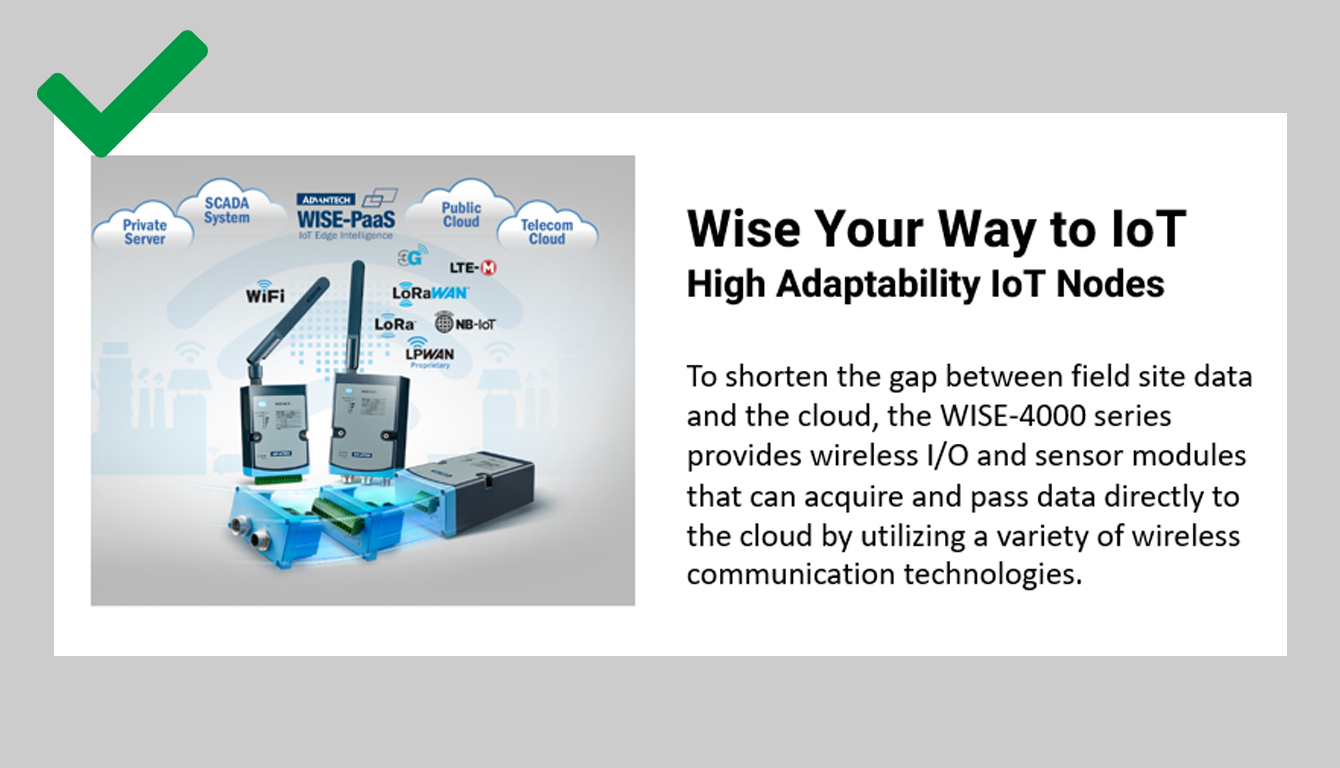
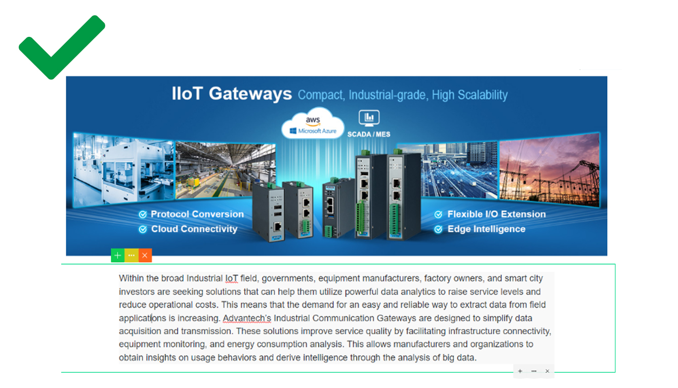
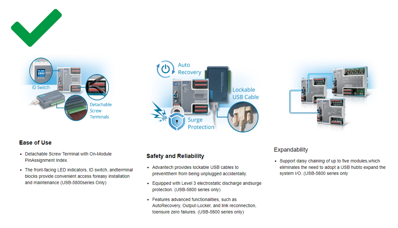
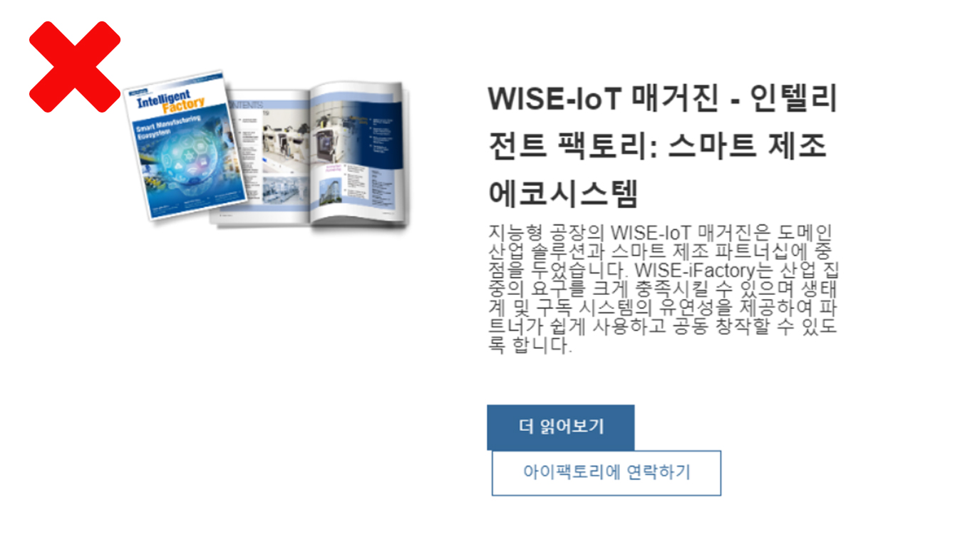
Please design the text content on a image as part of the graphical elment, and would imporve the readability.
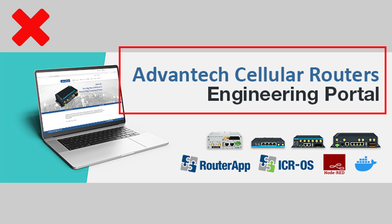
Don'ts
Plain text on the image that just too simple and easy to skip.
Dos
Add design to the text and style it as part of the design elements which make more effect to impress visitors.
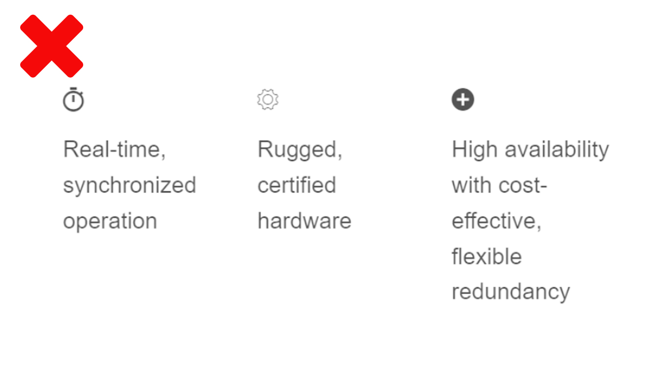
Don'ts
Plain text on the image that just too simple and easy to skip.
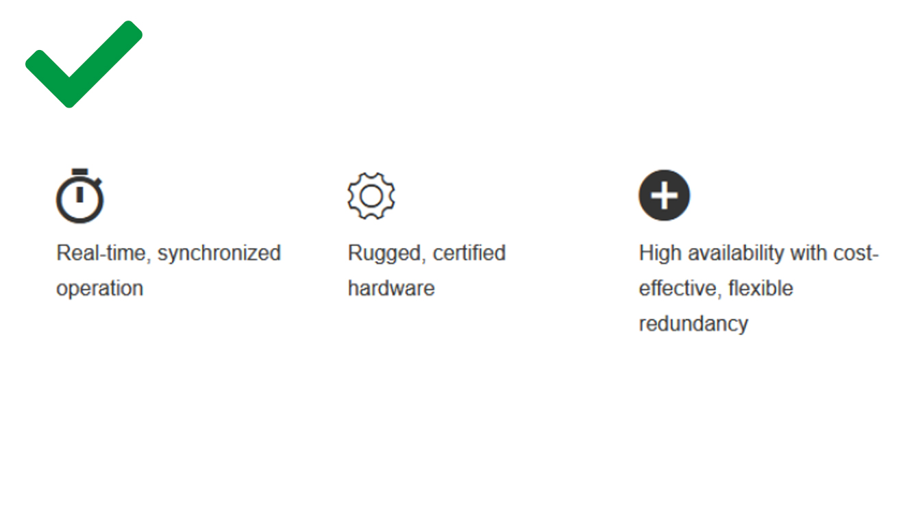
Dos
Using component and put text in the content to improve the readability
Component Editability
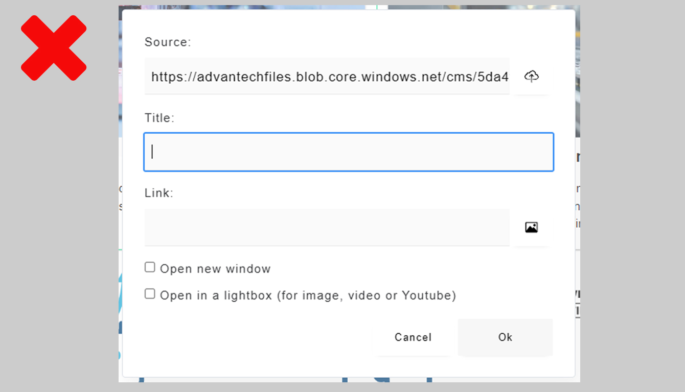
Older version of component would display normally on the webpage, but unable to modified without rebuild the content with new version of component.
Don'ts
Edit area can't add on new component.
Dos
Rebuild the content again with the new version of the component is suggested.
Don'ts
old version of the cards display abnormally.
Dos
Rebuild the content again with the new version of the component is suggested.
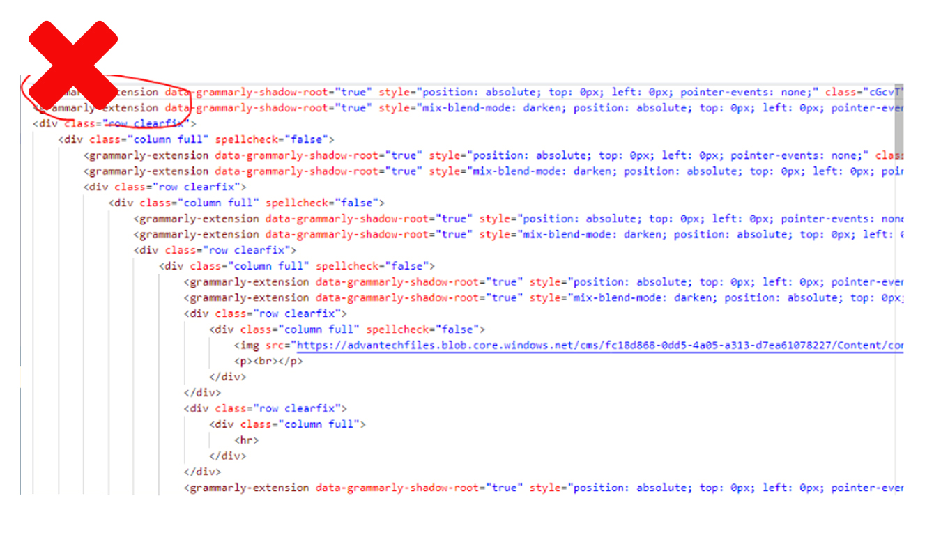
Don'ts
If you install grammary on your browser, it would add source code in the HTML
Dos
Turn the grammry off before you start editing
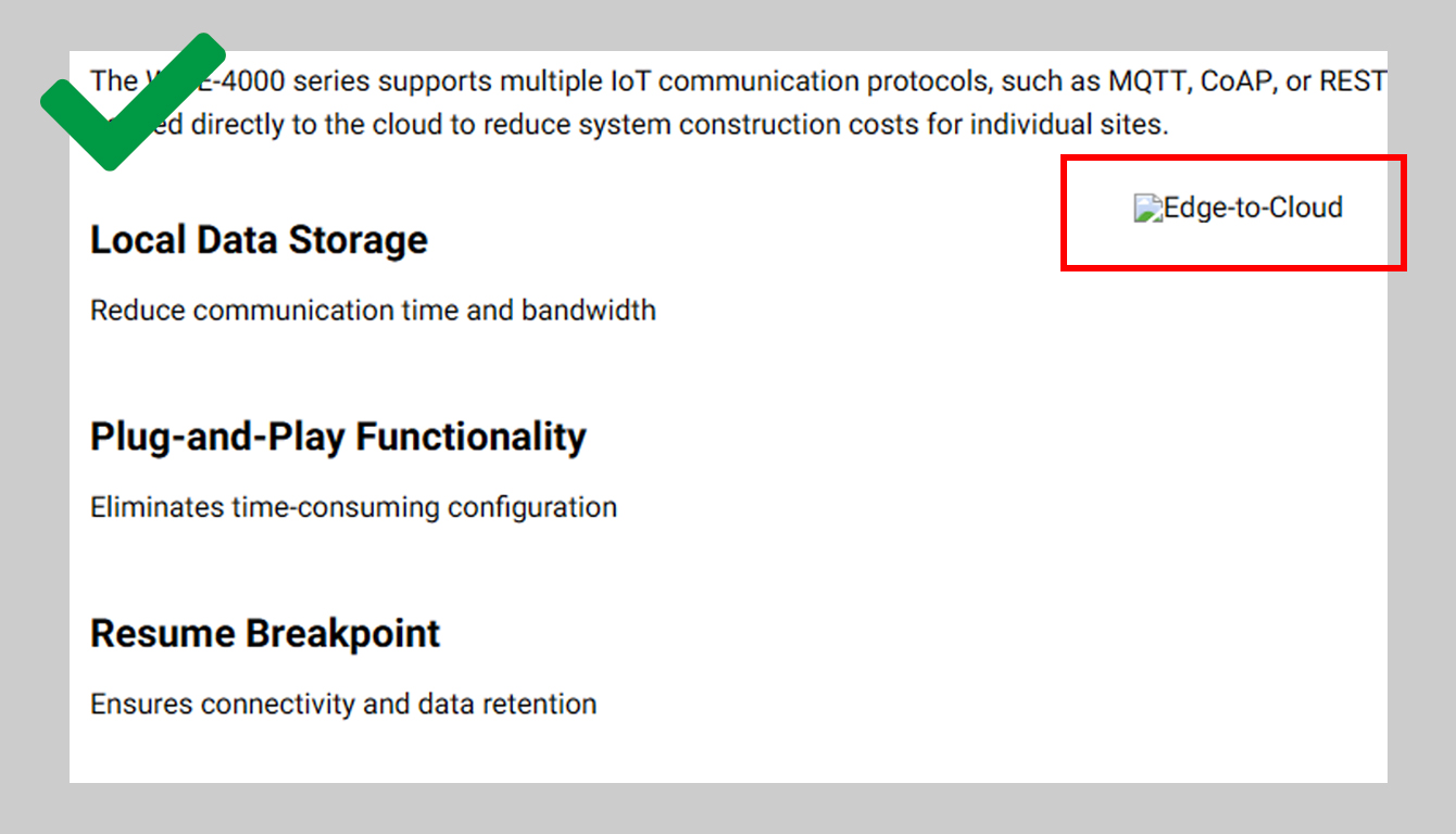
Remember to give the alternative text when using the image component, if an image fails to load or the user has blocked images, the browser will present the alternative text visually in place of the image.
Don'ts
Leave the image title blank, and the images means nothing to the search engine crawlers
Dos
Alt text will be displayed in place of an image if an image file cannot load.
Layout suggestion
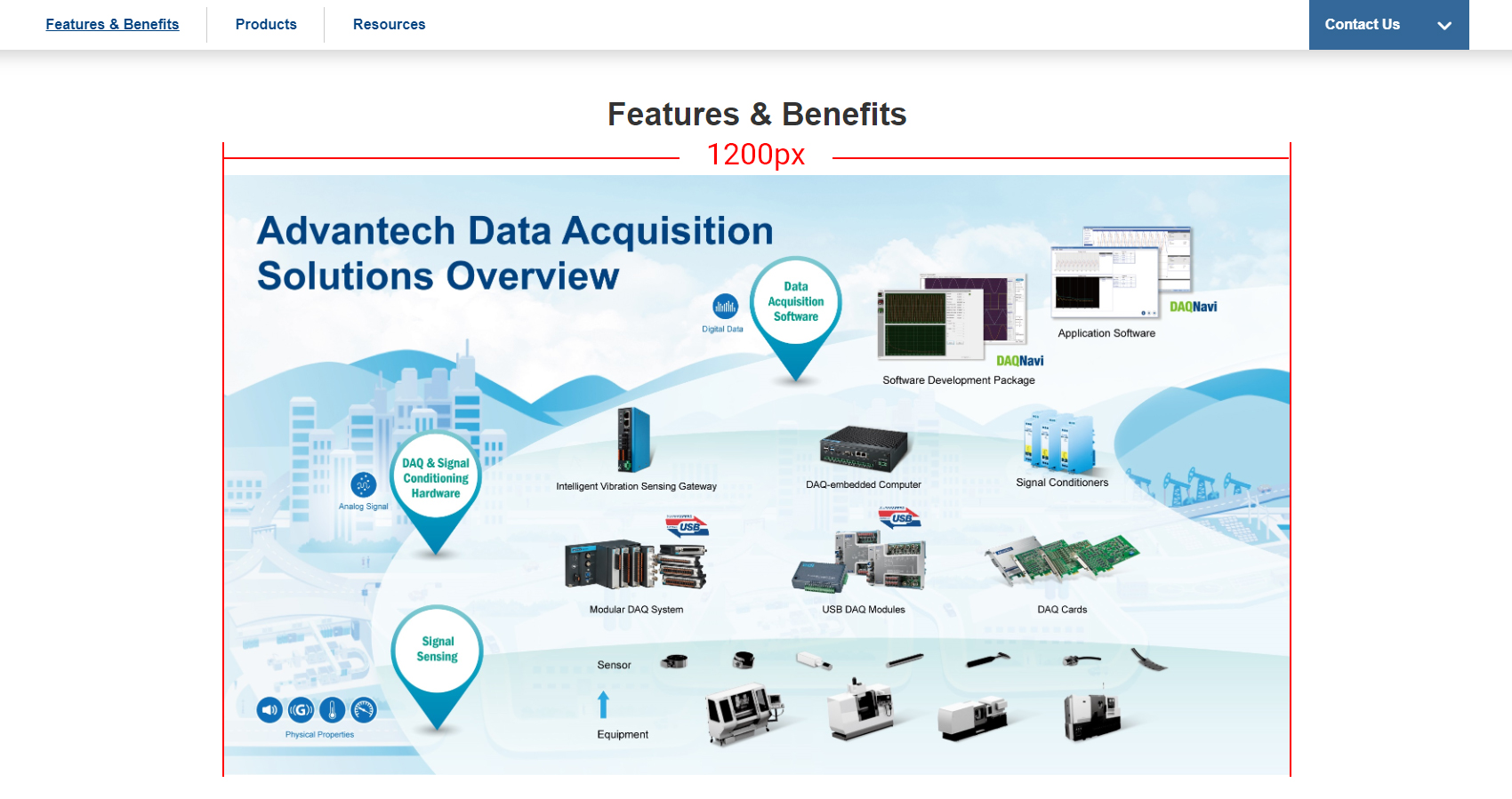
On a website with a width of 1600px, the maximum image width is 1200px. Please ensure that the image has sufficient pixel resolution.
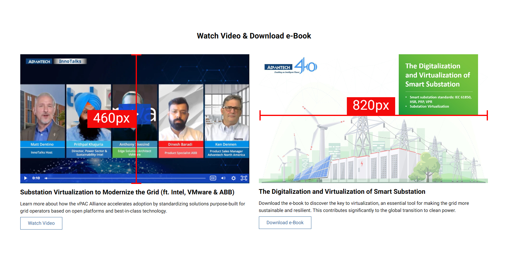
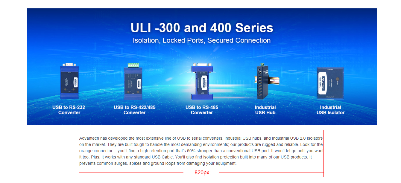
Please ensure that the image has sufficient pixel resolution, prepard image of width 820px and height of 460px for the component
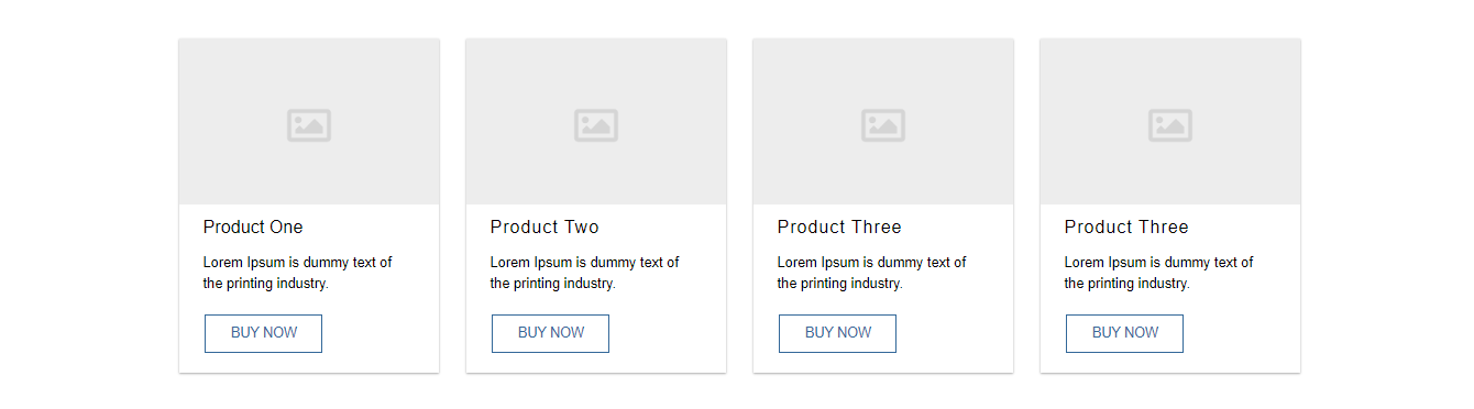
The webpage size becomes a maximum width of 1600 pixels. Please use more than three cards for each section.
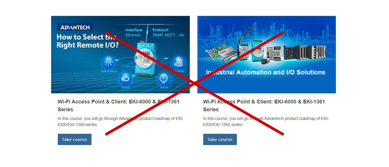
Don'ts
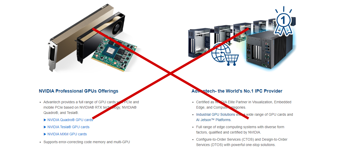
Putting two cards in one section would make the image area too big.
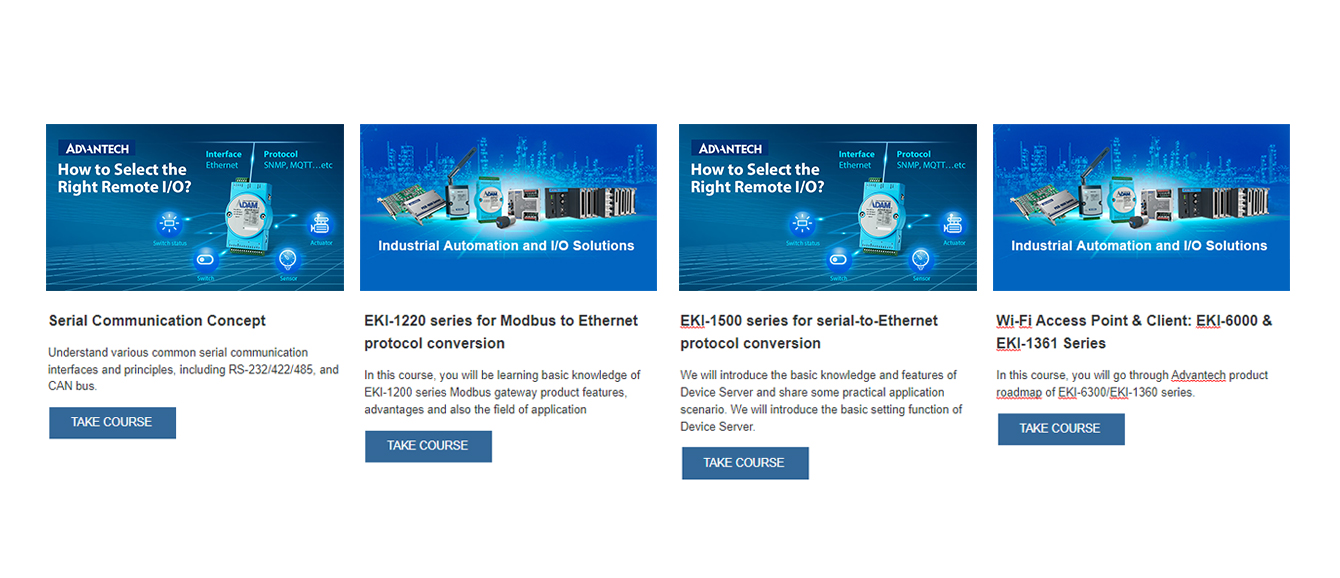
Dos
Put three to four cards in one section.
Don'ts
Putting two cards in one section would make the image area too big.
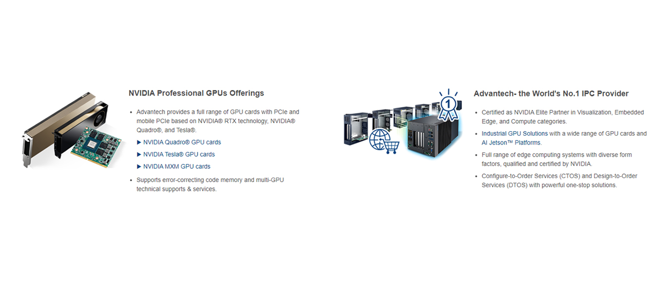
Dos
Use horizontal cards instead of the vertical card.
Don'ts
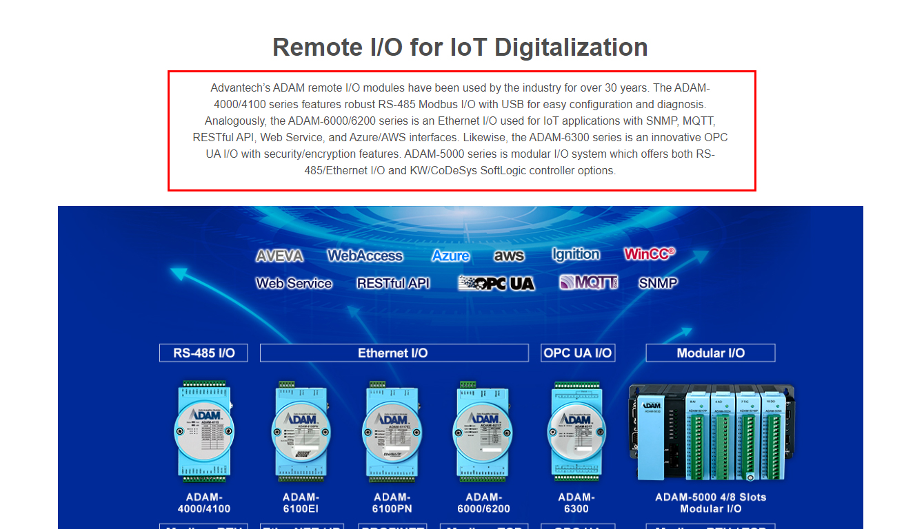
Please avoid use multiple column for long text content. The word break makes it difficult to read.

Dos
Use horizontal cards instead of the vertical card.
Don'ts
Please avoid using space tab to create blank space, which would caused elements display unblanced.
Dos
Keep the module's original settings which the margin or padding is preset
Don'ts
Please avoid increasing the font size without blance the content display.
Dos
Please set the proper font size
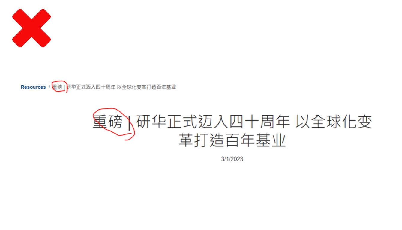
Don'ts
Please avoid use special symbol on the page title.
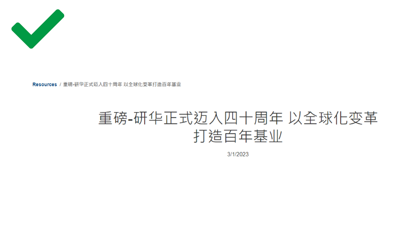
Dos
Use proper symble to display propler when it aslo appear in the breadcrumb.
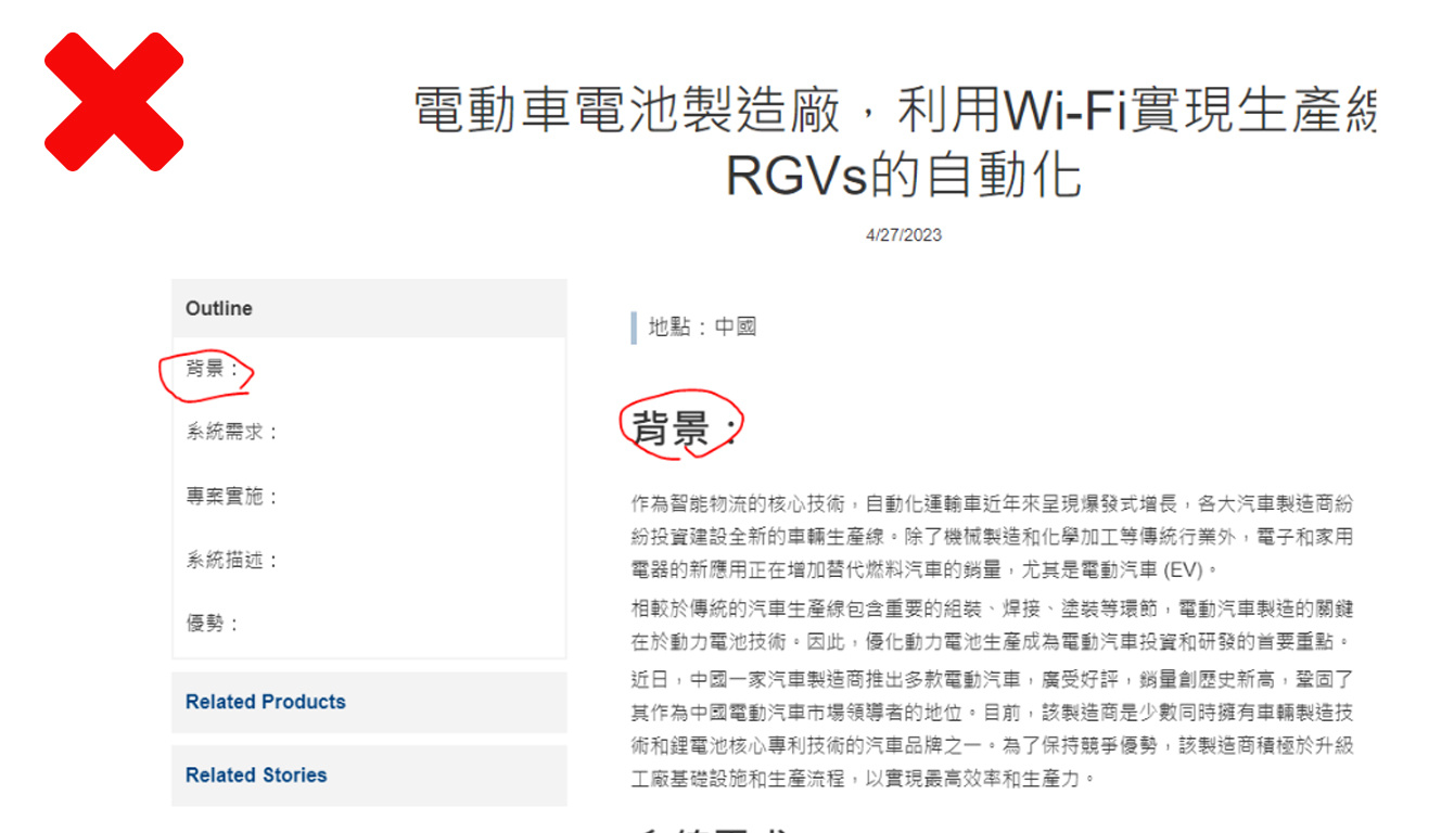
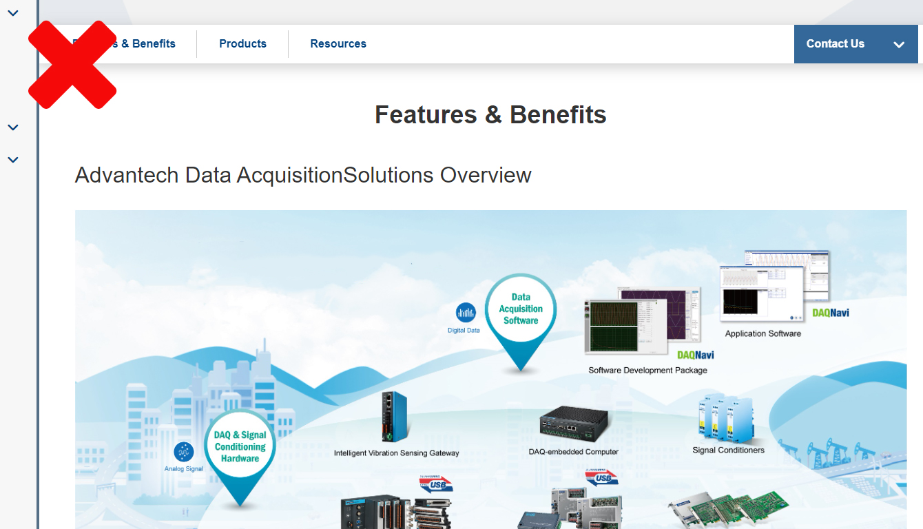
Don'ts
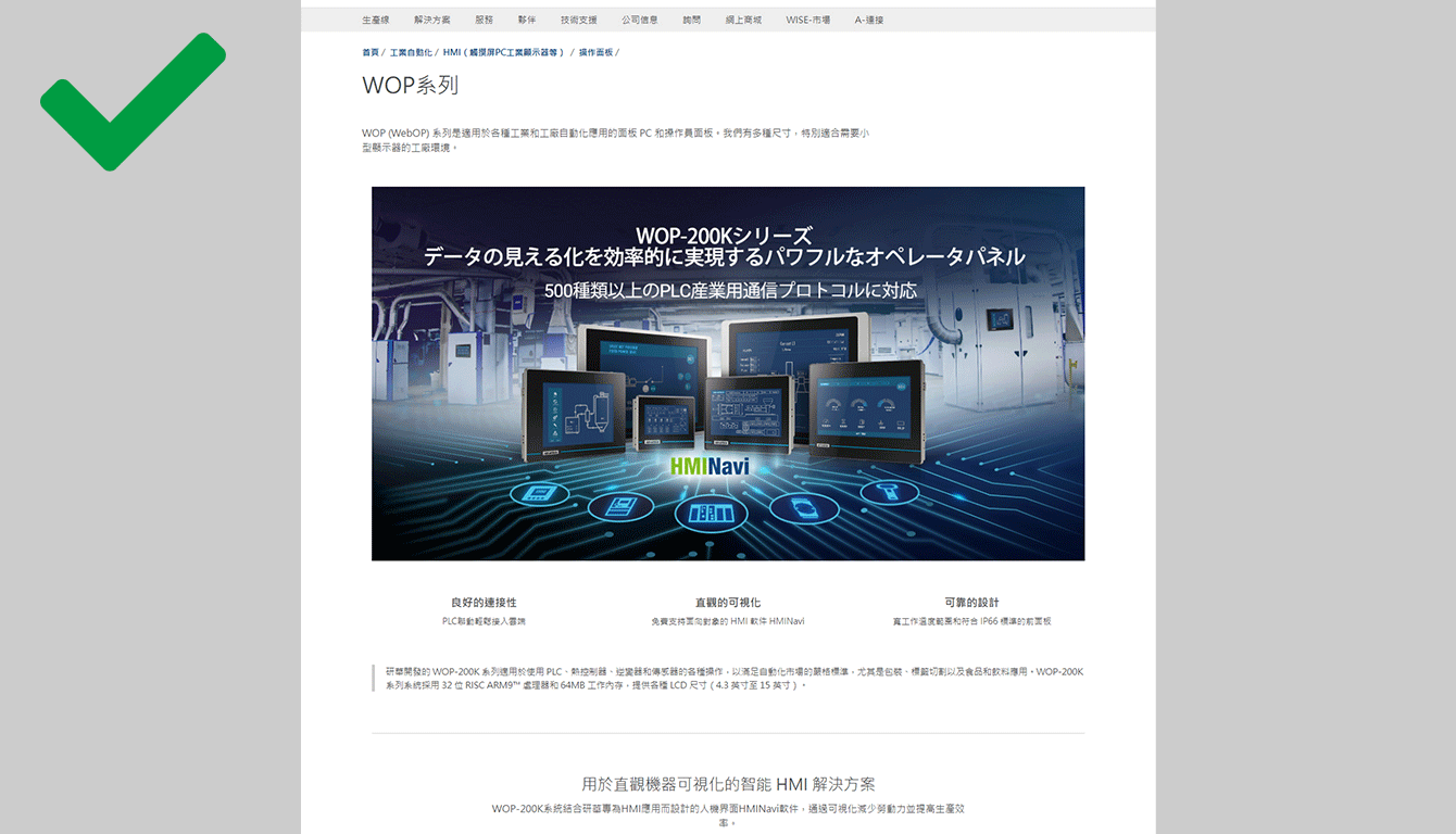
Please avoid use special symbol on the section title which would caused the left side quick select menu display inappropriate.
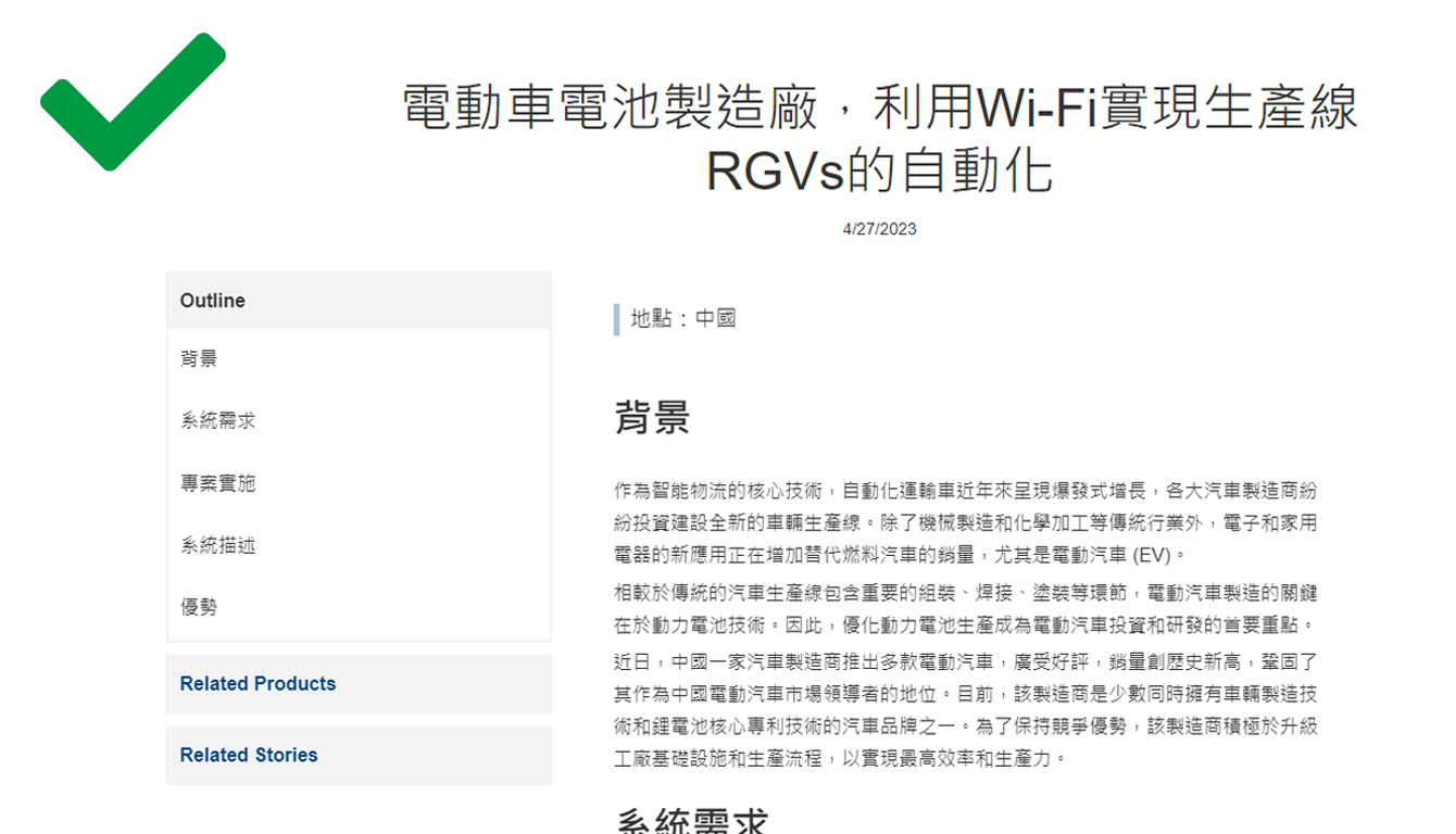
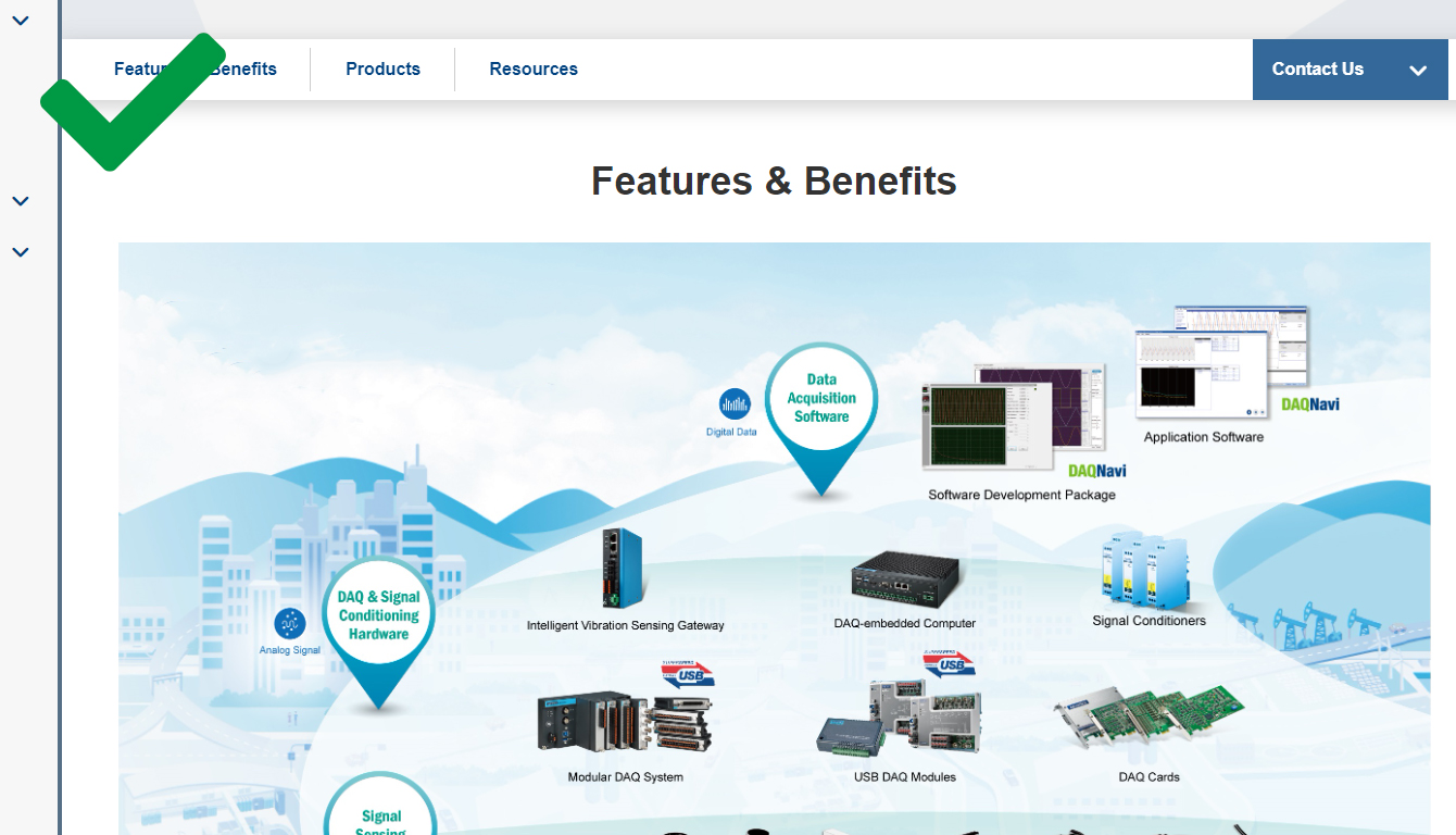
Dos
Keep section title in a simple and appropriate way.
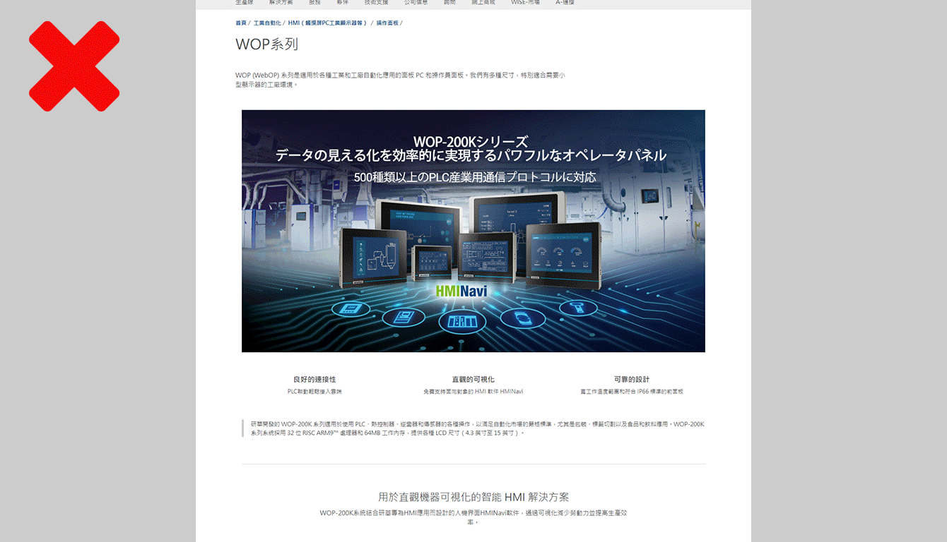
Don'ts
Please avoid using multimple main images that would in ceasing the overall height of the extended product contents
Dos
Please keep the reading pace short that would help user focus on the targeted content
Don'ts
Please avoid using multiple titles that might cause reading confusing
Dos
Only content title is simple and easy to understand
Text only block
Text only block's width should be set to 820px and aligned in the center.
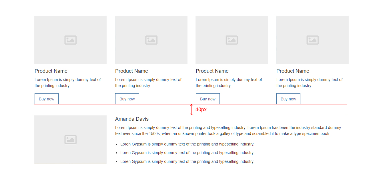
Margins
Margins between content blocks should be 40px
Learn how to add a blank in CMS platform. Click here