General Guidelines
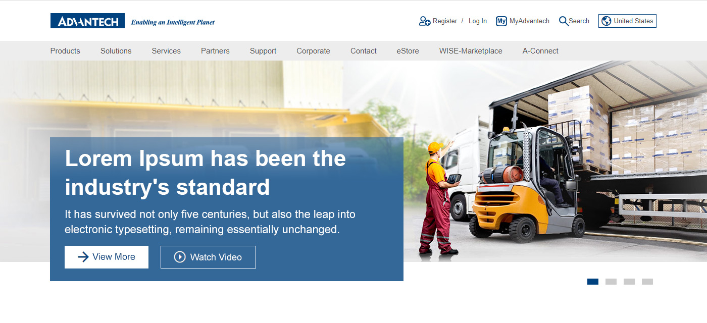
- 1. Key Visual Size : W1920xH400,JPG/PNG
- 2. File Size : 150KB or less. For image compression settings, please refer to Image Optimization.
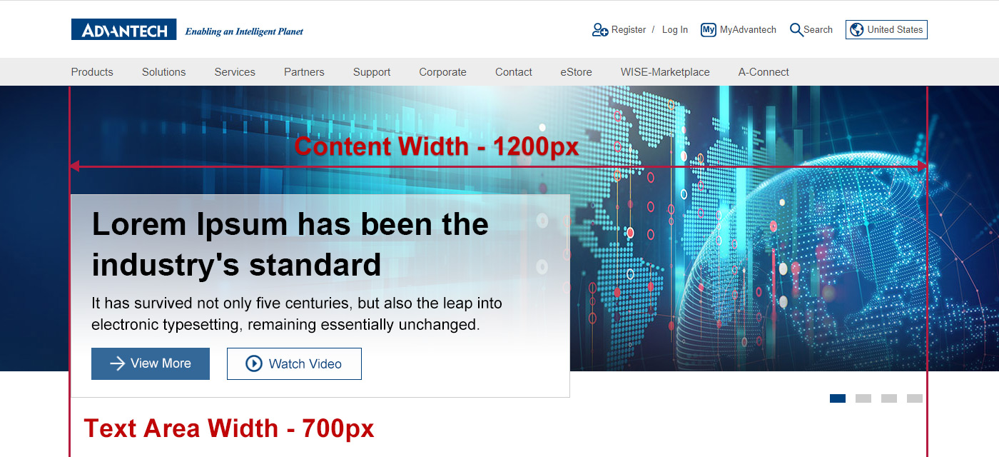
- 3. KV Content Width: Main graphical elements should be included within 1200px.
- 4. Main Title : Font Size:44px / Maximum number of characters: 50
- 5. Sub Title : Font Size:22px / Maximum number of characters: 150
- 6. Text Area Width : 700px
- 7. Text Area Height : Auto
- 8. Text Area Background Color :
- Advantech Blue with font color set to white.
- White background color with text color set to black.
- 9. Call to Actions :
- Font Size : 18px
- Primary button : Light Image use 85% Advantech Blue solid button / Dark Image use white solid button
- Secondary button : Light Image use Advantech Blue ghost button / Dark Image use white ghost button
- 10. Contrast ratio: Please make sure the Key visual readability meet the color contrast standard of 4.5. (Color contrast checker for images tool)
- 11. PSD File :
- Use to preview the effect of the text area, please hide the text area when outputting JPG/PNG.
- Two types of text area : light color / dark color, choose the appropriate version for the image when upload.
Light color text area
Dark color text area
Key Visual Design Suggestions
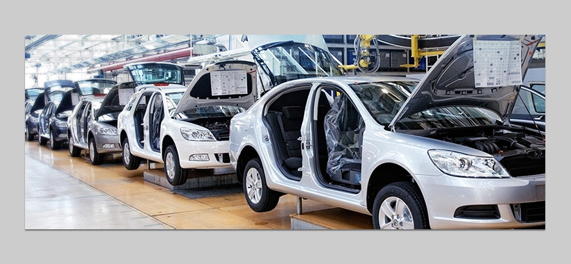
A Choose A Relavant Scenario
- Choose a relavant scenario is the best and instictive way to bring out the key message

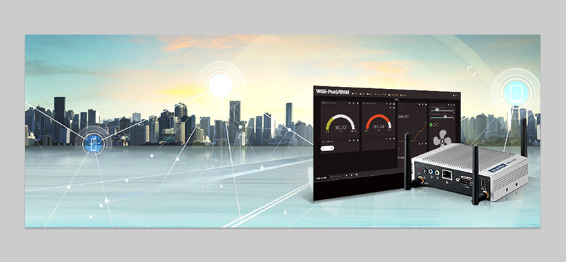
B The product is integrated into the scene
- Use relavant scenario that best describe the products.
- The integration should be as nature as possible.

C Picture in Picture
- There can be multiple small pictures overlapping the main image, and overlapping area should not exceed more than 60% of the main image.
- When use polygonal shapes for small pictures, use simple outlines.
D Use Products As Main Objects
- Products should not exceed more than 60% of the main image.
- Can be combined with drawing effects or icons.
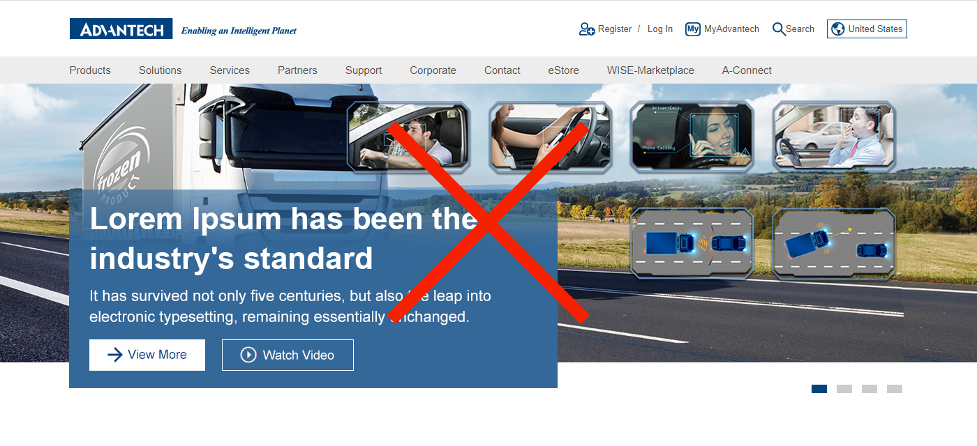
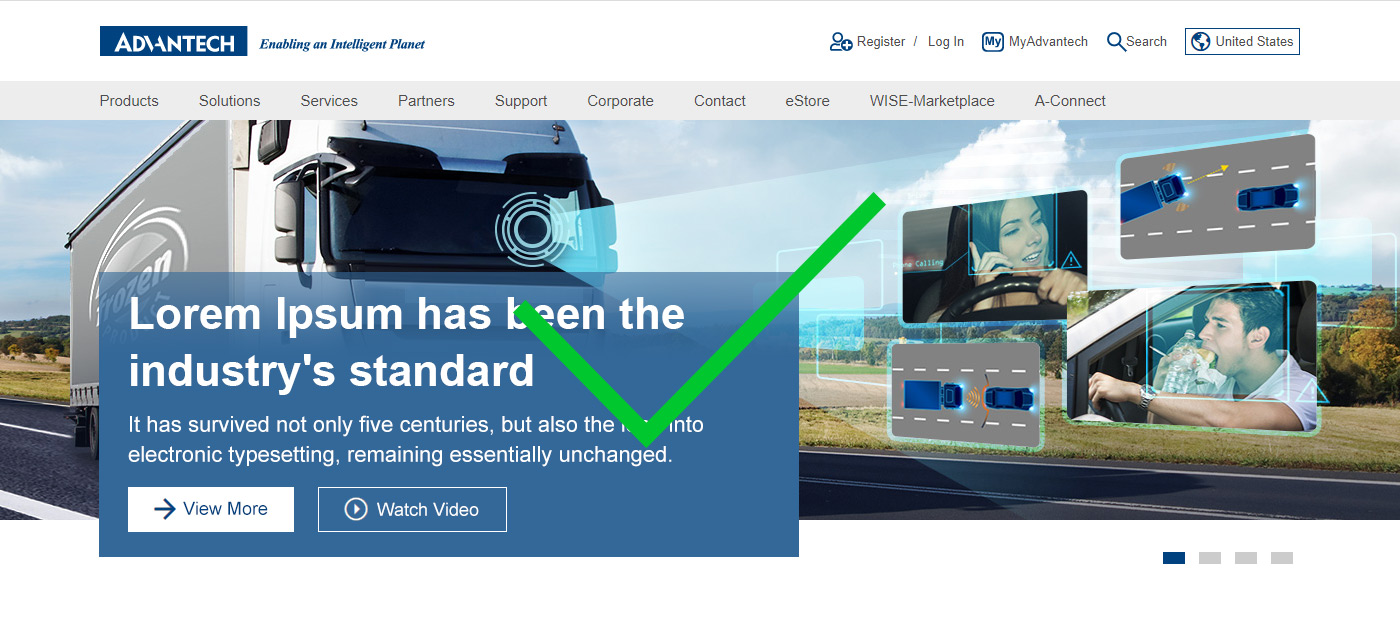
Dos and Don’ts
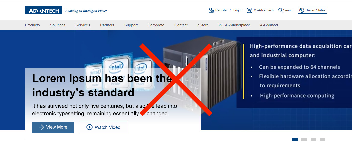
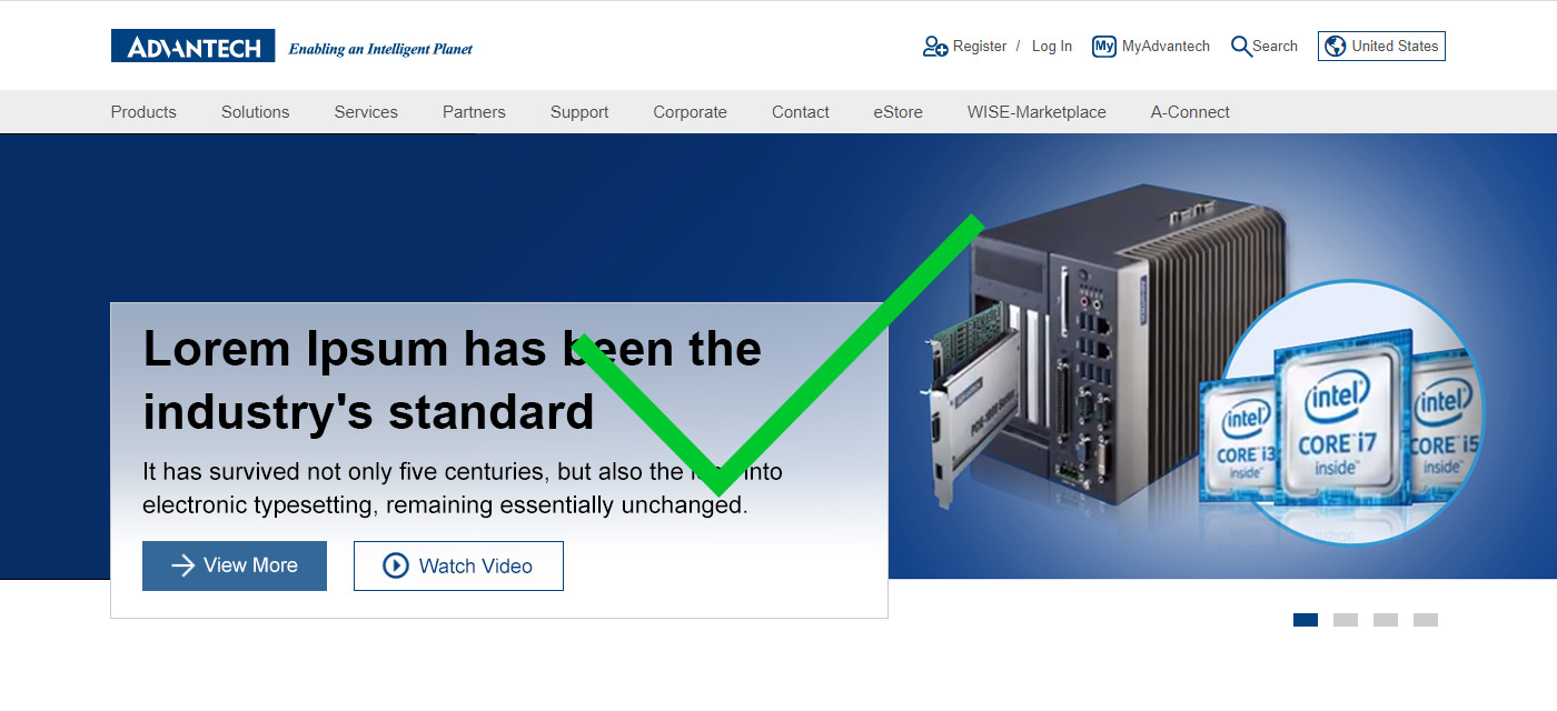
- Make sure the main graphics are visible and not overlaped by the text area.
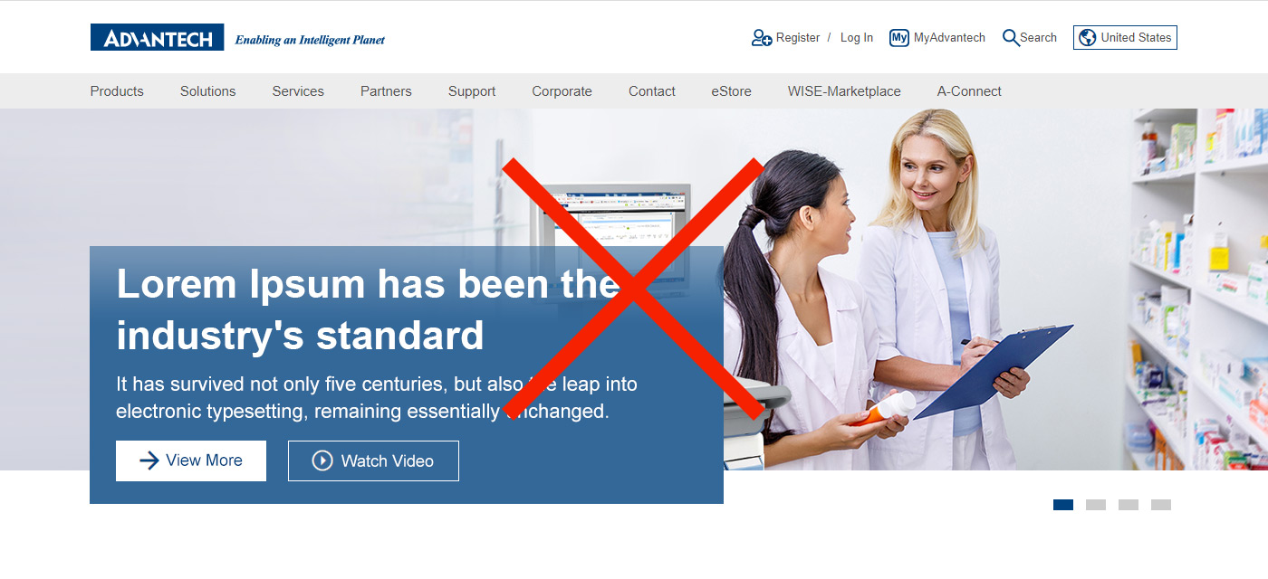
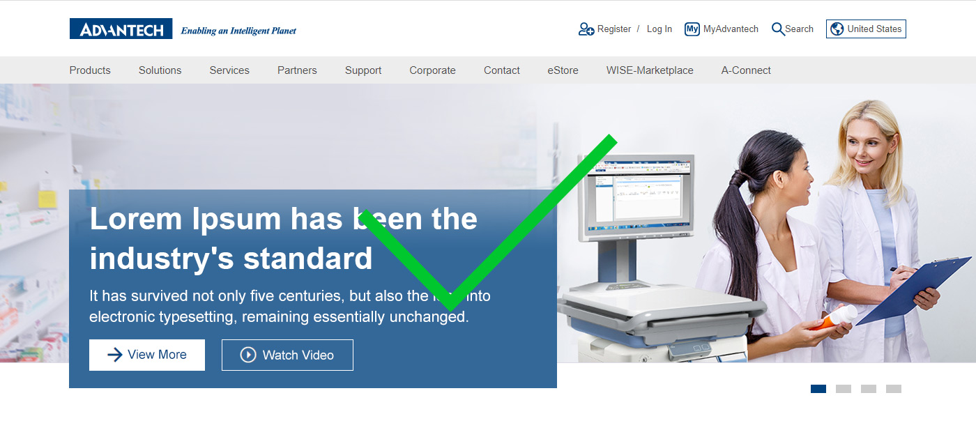
- Objects are harmoniously integrated with the text area, avoid the unnatural avoidance.
- The content of the images cannot have text.