Optimizing Images for Websites
Images comprise almost 75% of total page weight on most webpages, it’s crucial to make sure they’re displaying correctly, and not slowing the page down, because it improves conversions and SEO.
Image optimization is both an art and science. Finding the optimal settings for your image requires careful analysis along many dimensions: format capabilities, content of encoded data, quality, pixel dimensions, and more. This page will offer some tips for how you can best optimize your own images.
Image Content
1 Text to Image Ratio
Keep text to around 20% of the image space so you drawn attention to the text and don’t overwhelm the viewer’s eye. You want to balance the background, photos and text so your message has enough white space to stand out and be read. As a general guideline, we recommend a ratio of 20 percent text to 80 percent graphical elements on a key visual. However, thanks to the responsive design, meaning image swaps, image stacking, and the mobile devices can’t do anything else than scale the image down to fit on its screen. As a consequence, the text is likely to be tiny and the users will need to pinch the screen to see what’s being said.
In the end, the most important thing is to keep everything simple. Determine your core purpose, your branding and don’t deviate much further than that. The more content in the box, the more likely you are to confuse and therefore alienate your viewers.
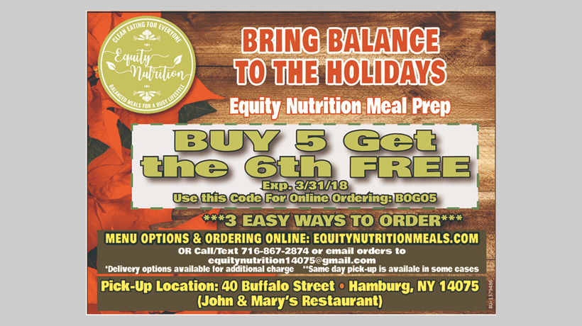
Information Overload
It's difficult to read, let alone delivering the message this ad is trying to sell
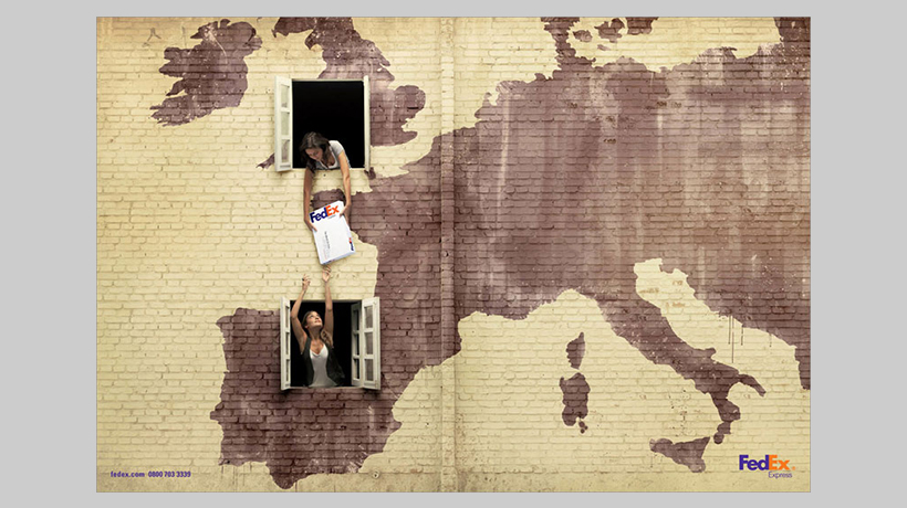
Keep Things Simple
The less information you present – the easier it is to understand.
2 Scenarios
Creating content for your banners should most definitely match your branding. These cover images don’t have to be an exact clone of each other, but they should definitely be a cohesive family.
Don'ts

Clichéd scenarios

Staged interactions
Dos

Innovation settings

Shows emotion
3 Color
Complex scenes with gradual color transitions (for example, gradients or sky) require larger color palettes to avoid visual artifacts such as the pixelated sky in the 5-bit asset. On the other hand, if the image only uses a few colors, we can change the "bit-depth" setting of the image from 24 bits to a smaller one so that the image file size can be reduced.
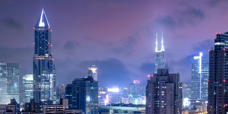
PNG 24-bit(16M colors)
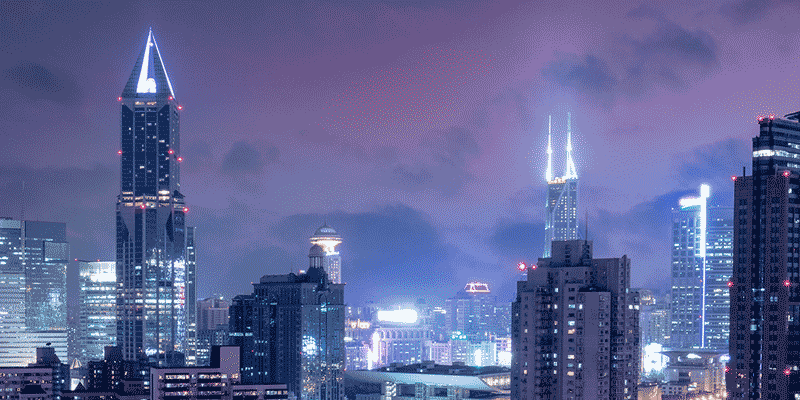
PNG 8-bit(32 colors)
4 Complexity
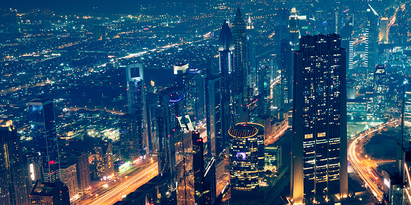
Two images with quality 70%. Because of the repetitive background and low average level of detail, the image on the left compresses extremely well at 89 kb. The image on the right however, outputs a much larger 535 kb because of the high level of detail and color.
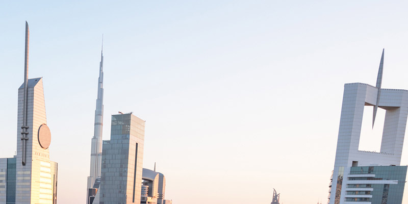
Low detail-36kb
High detail-215kb
Image Quality
1 Format
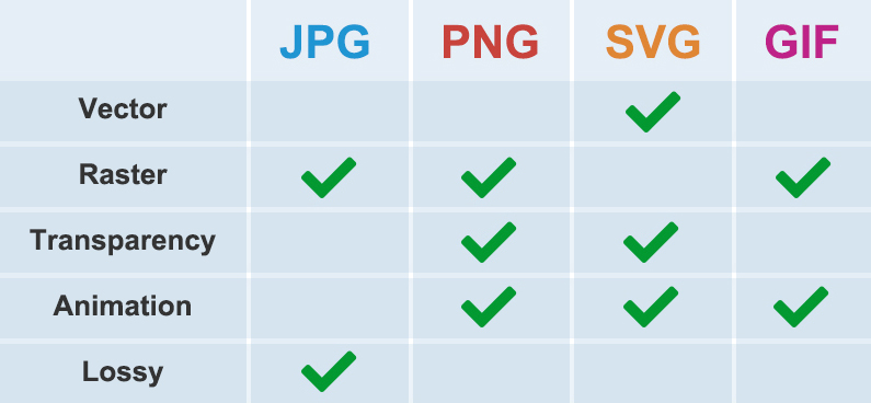
- JPG: This format is best for photographic images, like headshots and product photos. JPG images have small file sizes, which allows you to store more of them at once and improves page load times.
- PNG: This format provide transparent image backgrounds that can be overlaid on colored backgrounds, it is higher quality than JPG images, so it’s usually used for graphic-type images with more intricate designs.
- SVG: This format are responsive across devices, often used for vector art or solid colored graphics, like logos or line art.
2 Compression Levels
The most important aspect of optimization, is to compress your images sufficiently. Reducing the "quality" setting slightly, will reduce file size significantly. At 65 - 75% quality, it becomes difficult to detect any visual loss of quality, you will strike a great balance between file size and visual quality.
Below is an experiment with key visual banner, between 100% and 65%, the quality difference is unnoticeable, while the difference in image file size is enormous.
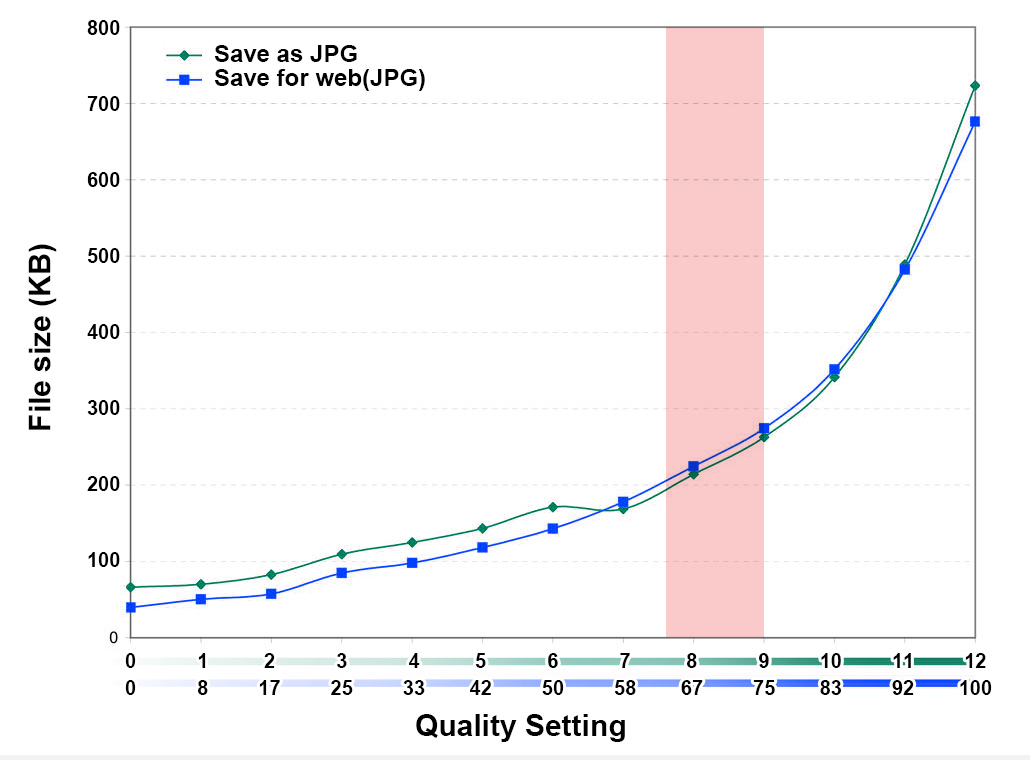
The "sweet spot" for optimal file size around quality level 65%-75%.
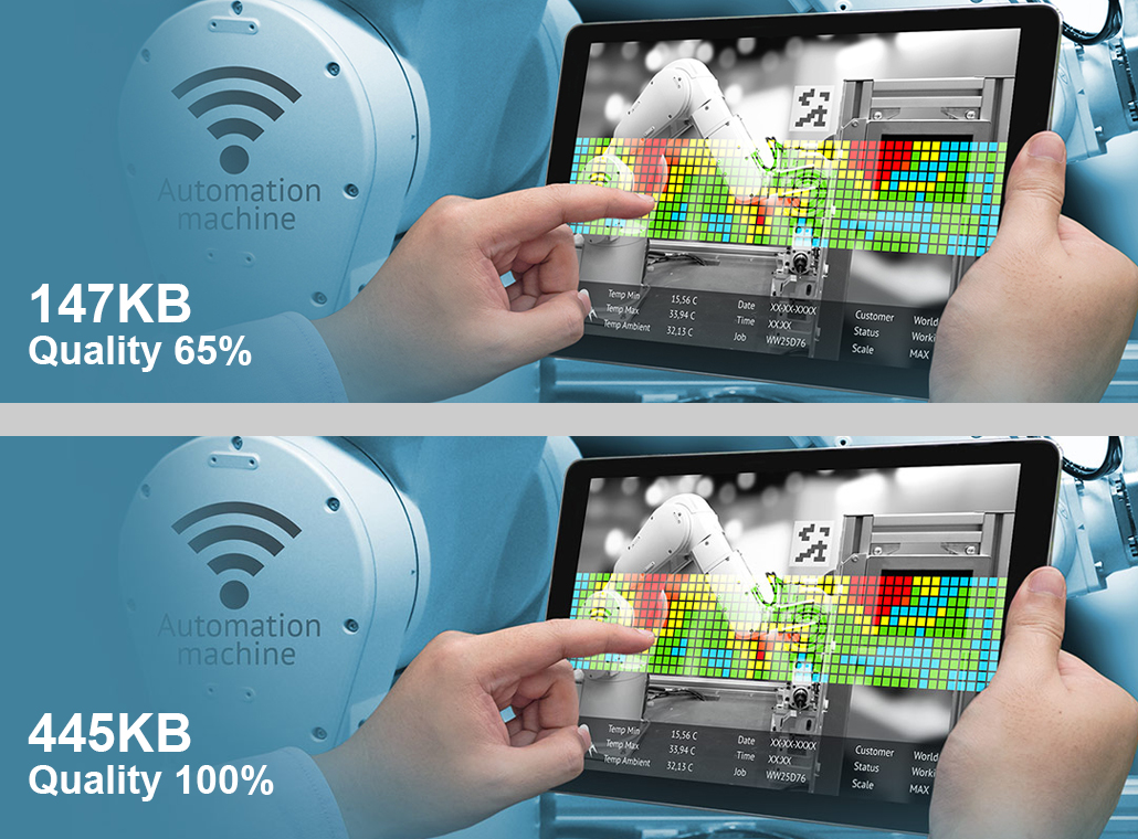
An experiment with key visual banner, Can you easily see any difference?
Related Links
- 1. Tools for Image Compression : Optimizilla / TinyJPG / ImageResizer
- 2. Research Report : Website Image Optimization
