Video Key Visual Guidelines
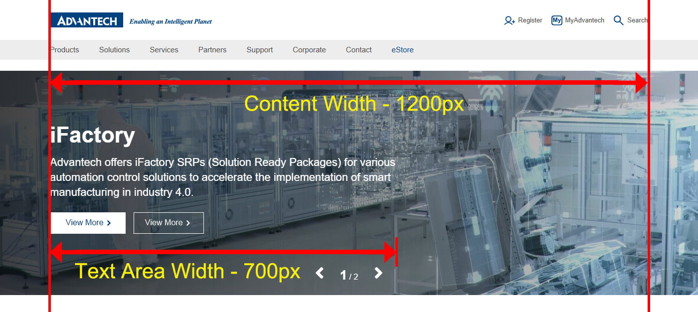
A Text Area
- 1. Main Title: Font Size:44px / Maximum number of characters: 50
- 2. Sub Title: Font Size:22px / Maximum number of characters: 150
- 3. Text Area Width: 700px
- 4. Text Area Height: Auto
- 5. Text Color:
- Light video use Black text (White to transparent mask in front of video)
- Dark video use white text (Black to transparent mask in front of video)
- If there is more than one video for one portal, must use the same text color.
- 6. Text Alignment: Left
- 7. Call to Actions:
- Primary button:Light video use 85% Advantech Blue solid button / Dark video use white solid button
- Secondary button:Light video use Advantech Blue ghost button / Dark video use white ghost button
- 8. KV Content Width: Main graphical elements should be included within 1200px
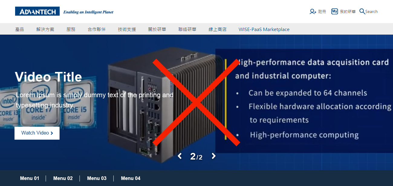
- 9. The content of the video cannot have text
B Video Specification
- 1. Video Size: W1920xH450
- 2. Allow File Format: MP4
- 3. Video Length : 5s~10s
C Video Play Settings
- 1. Music / Sound: Off
- 2. Autoplay: Allow autoplay, don't stop at the last frame
- 3. Slides: Can be still images or videos, 3 slides is the best recommended slide number
Mobile Device Key Visual Guidelines
- When the screen size less than 768px banner will instead of video.
- 1. Main Title: Font Size:28px
- 2. Sub Title: Font Size:14px
- 3. Text Color:
- Light video use Black text (75% White mask in front of image)
- Dark video use white text (75% Black mask in front of image)
- If there is more than one video for one portal, must use the same text color.
- 4. Banner Size: W768xH350,JPG
- 5. The content of the image cannot have text
Video Suggestions
A Short Story
Keep the story simple and only highlight the most amusing parts of it.
B Product Introduction
Focus on introducing the products and keep it easy to understand
C Conceptual Video
The concept might be abstract, but needs to clearly brings out the message or the culture which the video wants to deliver.
References
A Dos and Don’ts
- Make sure the main graphics are visible and not overlaped by the text area.
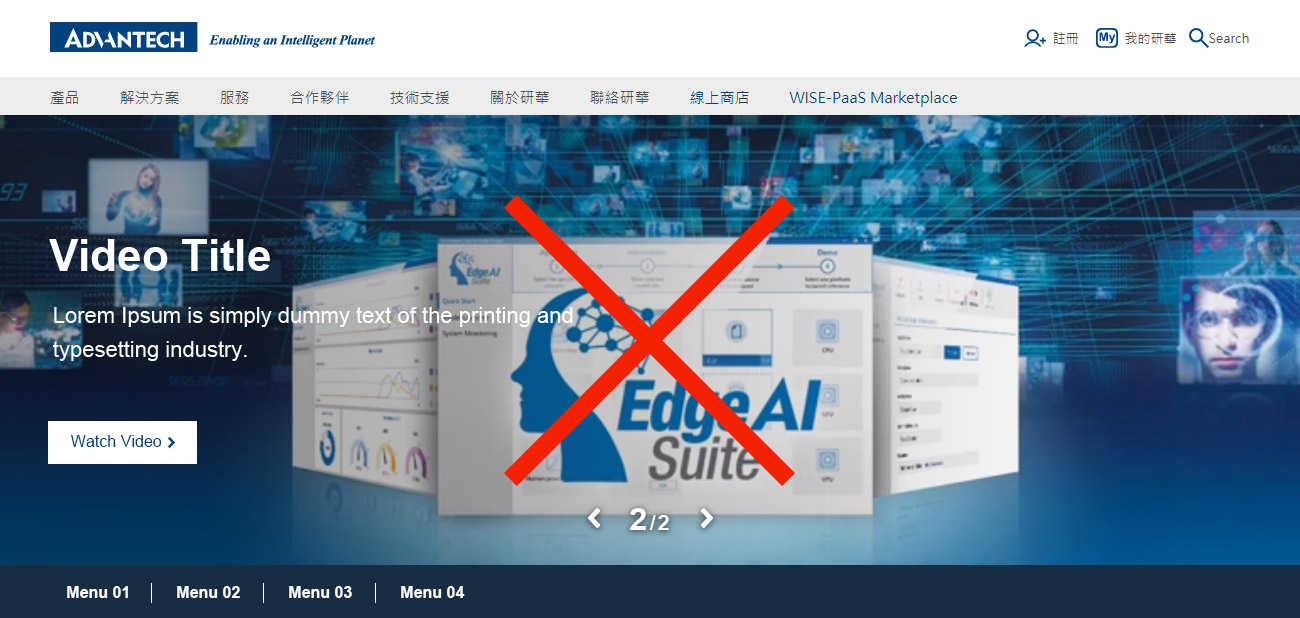
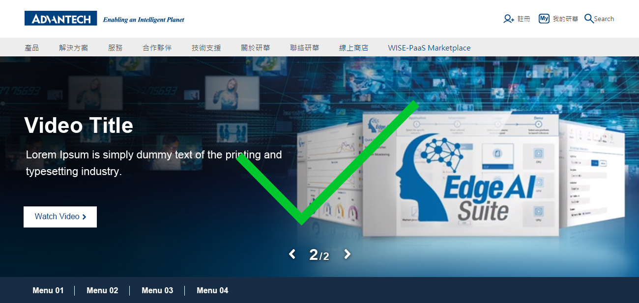
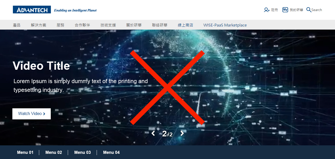
- Don't use complicated element in your video.
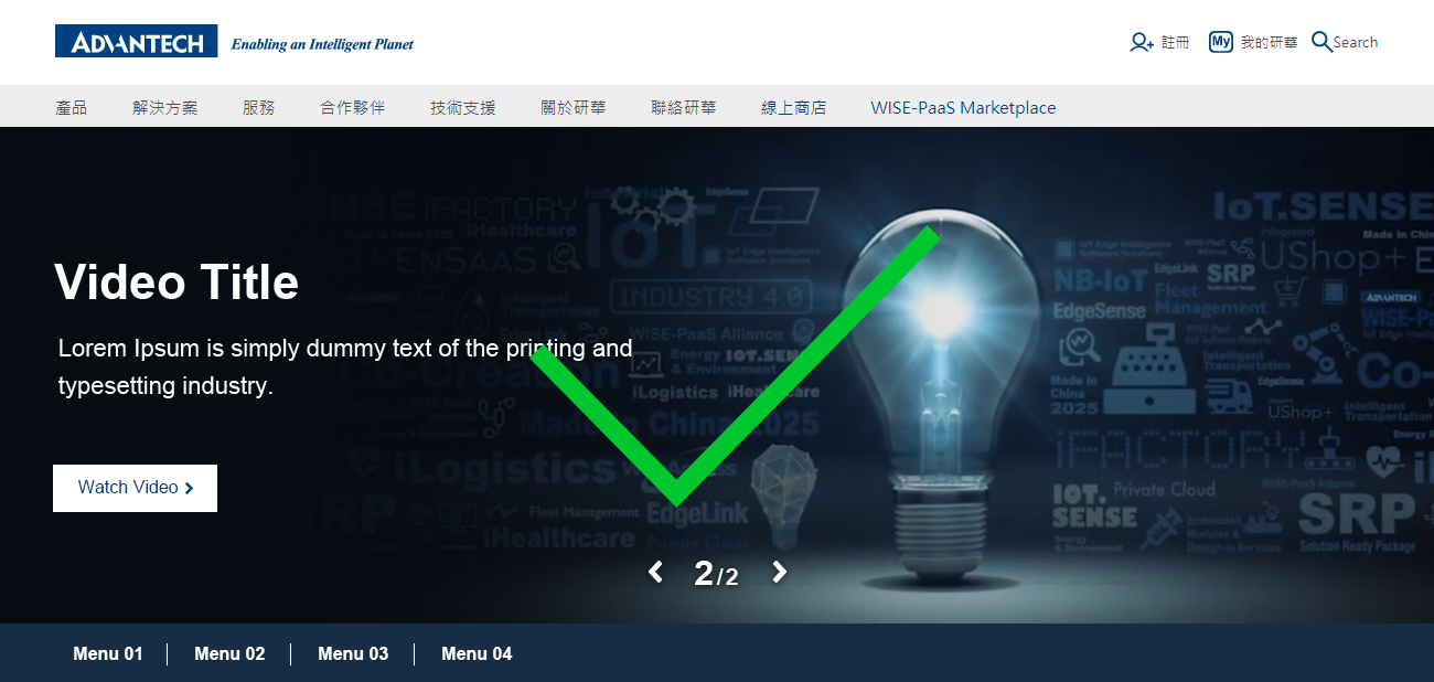
- Put the main product on the right.
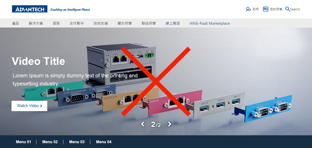
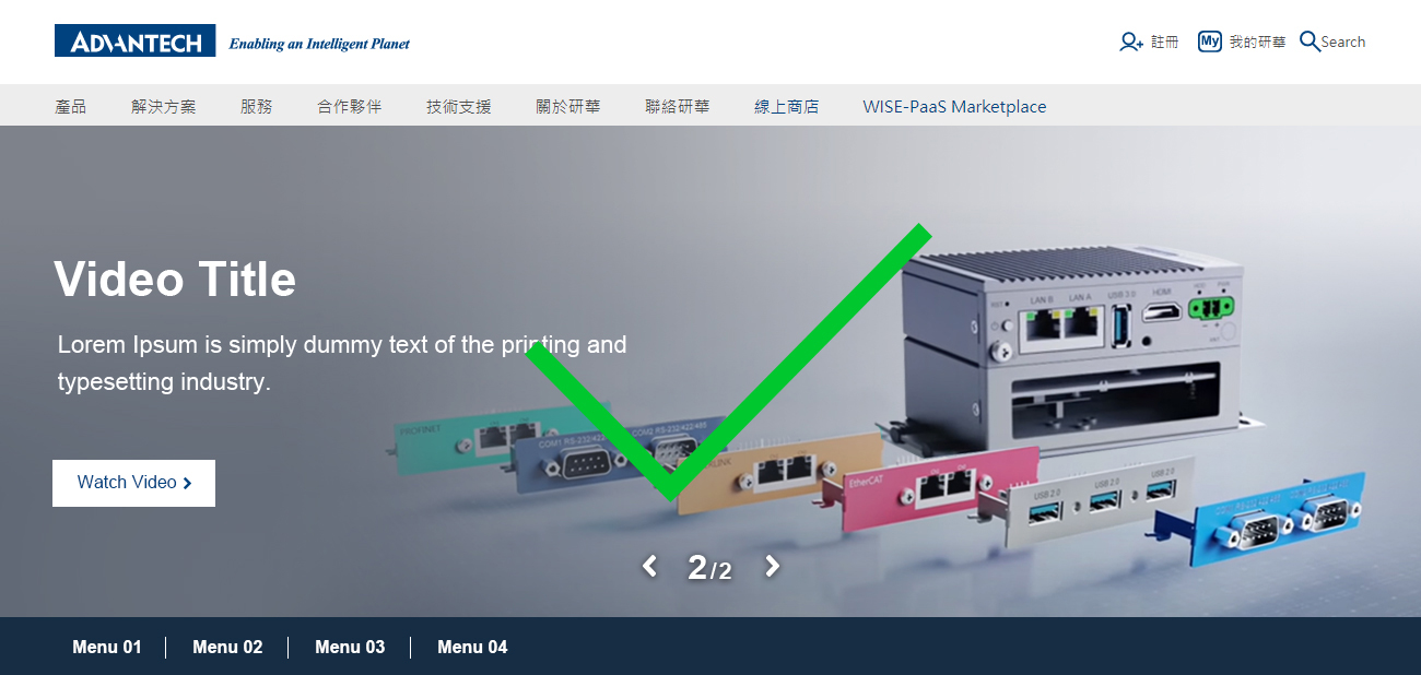
- The content of the video cannot have text.
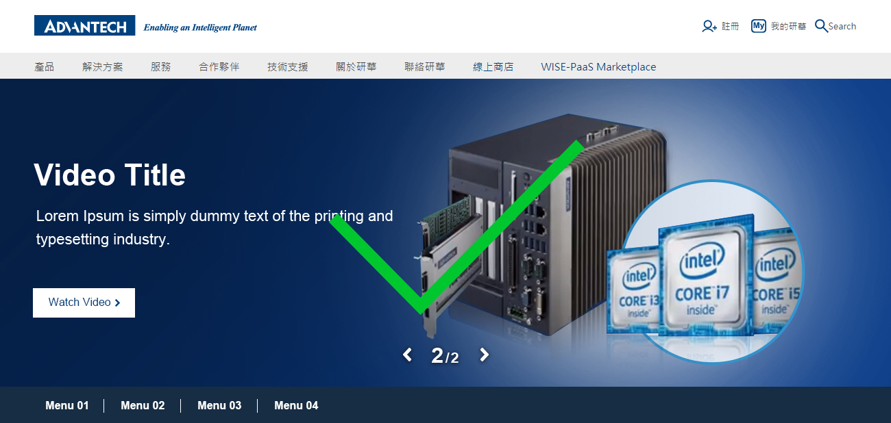
B Demo
Compare with picture KV
Benefit
- Video KV can increase page engagement. ( Engagement on a page means that visitors have submitted a form or clicked either of the following elements )
- Video KV let user want to see more slides.
Loss
- The click through rate of call to action in the video KV is lower than in picture KV.


