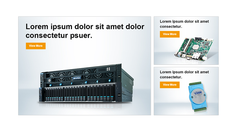
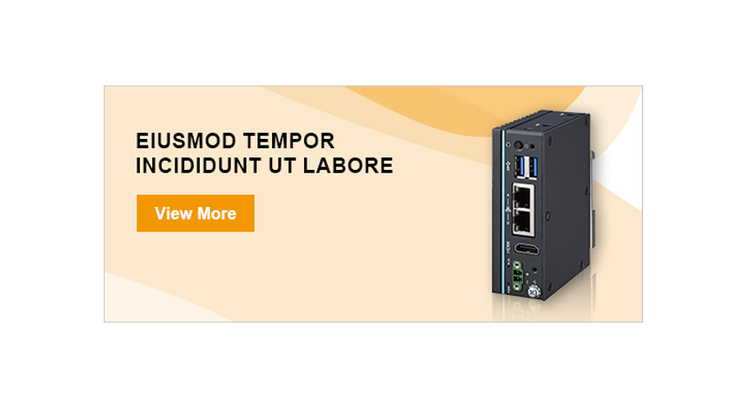
Key Visual Banner - PC
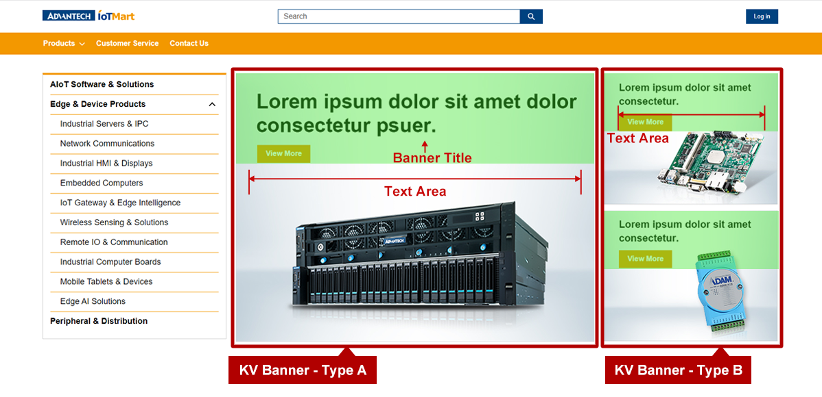
- 1. Image Size : Width 780px * Height 585px, JPG/PNG
- 2. File Size : 150KB or less. For image compression settings, please refer to Image Optimization.
- 3. Main Graphical Elements : Please avoid overlapping main graphical elements with the text area.
- 4. Banner Title :
- Type A : Font Size 44px / For the best layout, use two lines of content with approximately 25 to 35 characters.
- Type B : Font Size 22px / For the best layout, use two lines of content with approximately 25 to 35 characters.
* The actual effect will depend on the word used, so please use the PSD file to preview and confirm.
- 5. Text Area :
- Type A : Full Width * Height 195px
- Type B : Full Width * Height 140px
- 6. Call to Actions : Set from the admin portal.
- 7. Contrast ratio: Please make sure the banner readability meet the color contrast standard of 4.5. (Color contrast checker for images tool)
- 8. PSD File : Recommended to download the template beforehand to ensure that the size and specifications are correct when creating a banner.
KV Banner - Mobile
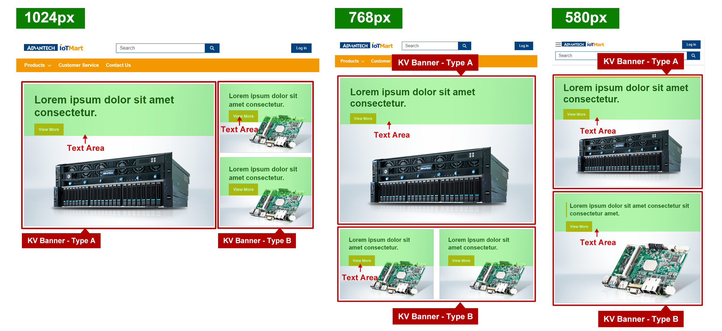
- 1. Banner Title :
- Type A : Font Size:36px / For the best layout, use two lines of content with approximately 25 to 35 characters.
- Type B : Font Size:22px / For the best layout, use two lines of content with approximately 25 to 35 characters.
* The actual effect will depend on the word used, so please use the PSD file to preview and confirm.
- 2. Text Area :
- Type A : Full Width * Height 175px
- Type B : Full Width * Height 140px
AD Banner - PC

- 1. Image Size : Width 780px * Height 230px, JPG/PNG
- 2. File Size : 100KB or less. For image compression settings, please refer to Image Optimization.
- 3. Main Graphical Elements : Please avoid overlapping main graphical elements with the text area.
- 4. Banner Title : Font Size:20px / For the best layout, use two lines of content with approximately 25 to 35 characters.
* The actual effect will depend on the word used, so please use the PSD file to preview and confirm.
- 5. Text Area : Width 300px * Height 150px
- 6. Call to Actions : Set from the admin portal.
- 7. Contrast ratio: Please make sure the banner readability meet the color contrast standard of 4.5. (Color contrast checker for images tool)
- 8. PSD File : Recommended to download the template beforehand to ensure that the size and specifications are correct when creating a banner.
AD Banner - Mobile

- 1. Banner Title : Font Size:20px / It is recommended to use character: 25~35. The actual effect will depend on the word used.
* For the best layout, the banner title text should have two lines. Please use the PSD file to preview and confirm.
- 2. Text Area :
- 1280px : Width 220px * Height 150px
- 768px : Width 360px * Height 170px
Template & SOP
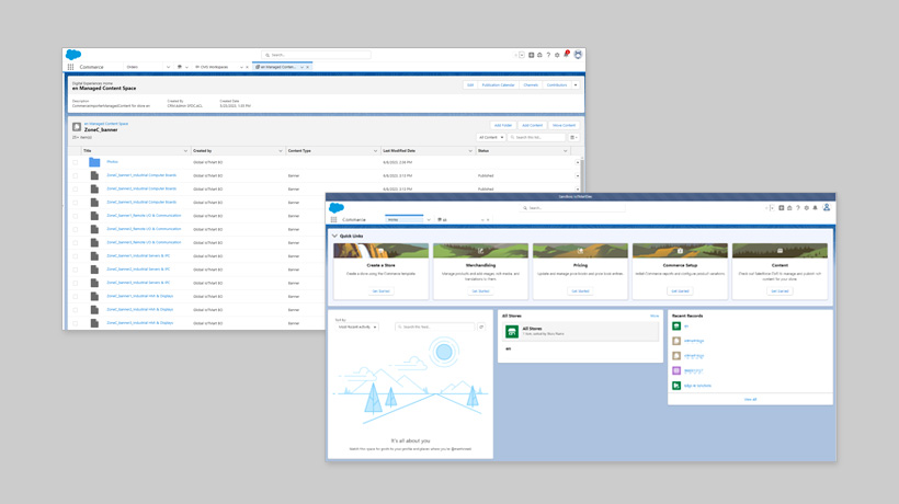
We provide PSD templates for the pages to preview the visual effects and confirm. Please insert text and content into the PSD files according to your needs and adjust the order and quantity accordingly. Export the images individually as JPG/PNG files without including text. Edit the text directly in the CMS system .
Please refer to the SOP manual for instructions on how to create content and upload files in the CMS system, as well as for details on other functionalities.
Color Suggestions
The colors are based on Advantech blue and orange from CIS Guide and commonly used grayscale colors. Please refer to them and design with appropriate elements.
Design Suggestions
Dos
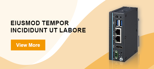
Gentle curves paired with a light-colored background.
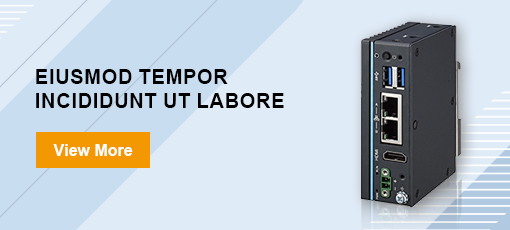
Geometric shapes and lines present a sense of technology.
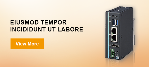
Clean and light pure gradient colors.
Don’ts
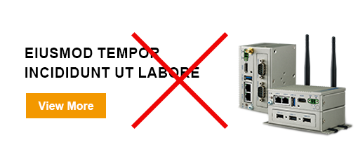
Avoid using all-white、look like it's unfinished for the background.
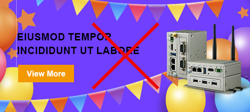
Avoid using inappropriate colors or overly flashy base map designs.
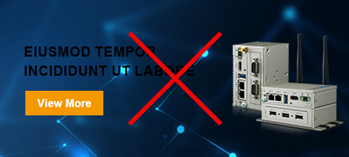
Ensure text meets 4.5 color contrast standard for readability. (Image color contrast tool)
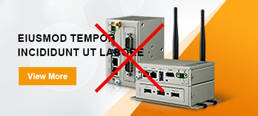
Avoid overlapping main graphical elements with the text area.
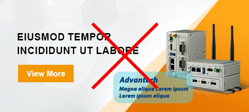
The content of the images cannot have text.
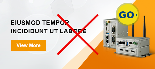
The content of the images cannot have button.
