Text to Image Ratio
Keep text to around 20% of the image space so you drawn attention to the text and don’t overwhelm the viewer’s eye. You want to balance the background, photos and text so your message has enough white space to stand out and be read. As a general guideline, we recommend a ratio of 20 percent text to 80 percent graphical elements on a key visual. However, thanks to the responsive design, meaning image swaps, image stacking, and the mobile devices can’t do anything else than scale the image down to fit on its screen. As a consequence, the text is likely to be tiny and the users will need to pinch the screen to see what’s being said.
In the end, the most important thing is to keep everything simple. Determine your core purpose, your branding and don’t deviate much further than that. The more content in the box, the more likely you are to confuse and therefore alienate your viewers.

Information Overload
It's difficult to read, let alone delivering the message this ad is trying to sell

Keep Things Simple
The less information you present – the easier it is to understand.
Consistency
Consistency is the key for your audience to recognize your brand image. You could use the main graphical elements from your previously published materials, and you should keep your fonts and colors consistent, because that’s a sure sign of good branding.
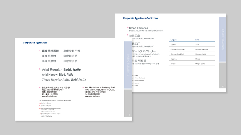
For the use of the corporate typeface guidelines, please refer to the Advantech CIS Guide Book
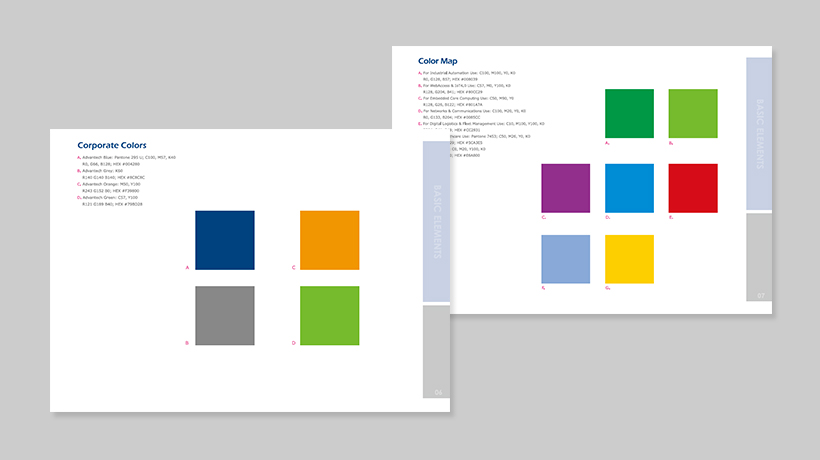
For the use of the corporate color guidelines, please refer to the Advantech CIS Guide Book - Color Map"
Choosing photos / images
Creating content for your banners should most definitely match your branding. These cover images don’t have to be an exact clone of each other, but they should definitely be a cohesive family. The following is a short list of what to avoid or follow when choosing photos and images for your key visual:
Don'ts

Clichéd scenarios

Staged interactions

Obvious posing

Poor resolution
Dos

Innovation settings

Shows emotion

Natural composition

Clear image
Image optimization
Image optimization is both an art and science: an art because there is no one definitive answer for how best to compress an individual image, and a science because there are many well developed techniques and algorithms that can significantly reduce the size of an image. Finding the optimal settings for your image requires careful analysis along many dimensions: format capabilities, content of encoded data, quality, pixel dimensions, and more.
Trust us, you don’t want Google to hate your website. Fortunately, you can reduce your image’s file sizes to help improve your website’s performance. One problem with formatting them is that modifications often reduce their quality (which in turn might make the visitor hate your website). That’s not a bad thing as long as you don’t make them ugly.
Optimize your content for the smallest file size possible. The target file size should be somewhere around 100kb ~150 kb, depending on the size of the ad.

Low compression (high quality) JPG – 590 KB

High compression (low quality) JPG – 68 KB

Medium compression (great quality) JPG – 115 KB